Stefan Miloš
Why Architecture Cannot Exist Without the Resistance of Reality
What is most often presented today as an entry into design is, in reality, an accelerated course in image production. Fast, accessible, and built on the promise that producing a convincing render is enough to deliver a project. This logic holds as long as the project remains a frame on a screen. The moment it needs to become space, a layer of work emerges that these courses do not address.
The idea that space can exist as an image is not new. In the 18th century, Giovanni Battista Piranesi built his reputation on thousands of engravings that operated at the edge of fiction. His interiors and urban visions function precisely because they were never required to answer how they would be built, used, or sustained. Space exists as an idea, free from material, cost, and time.
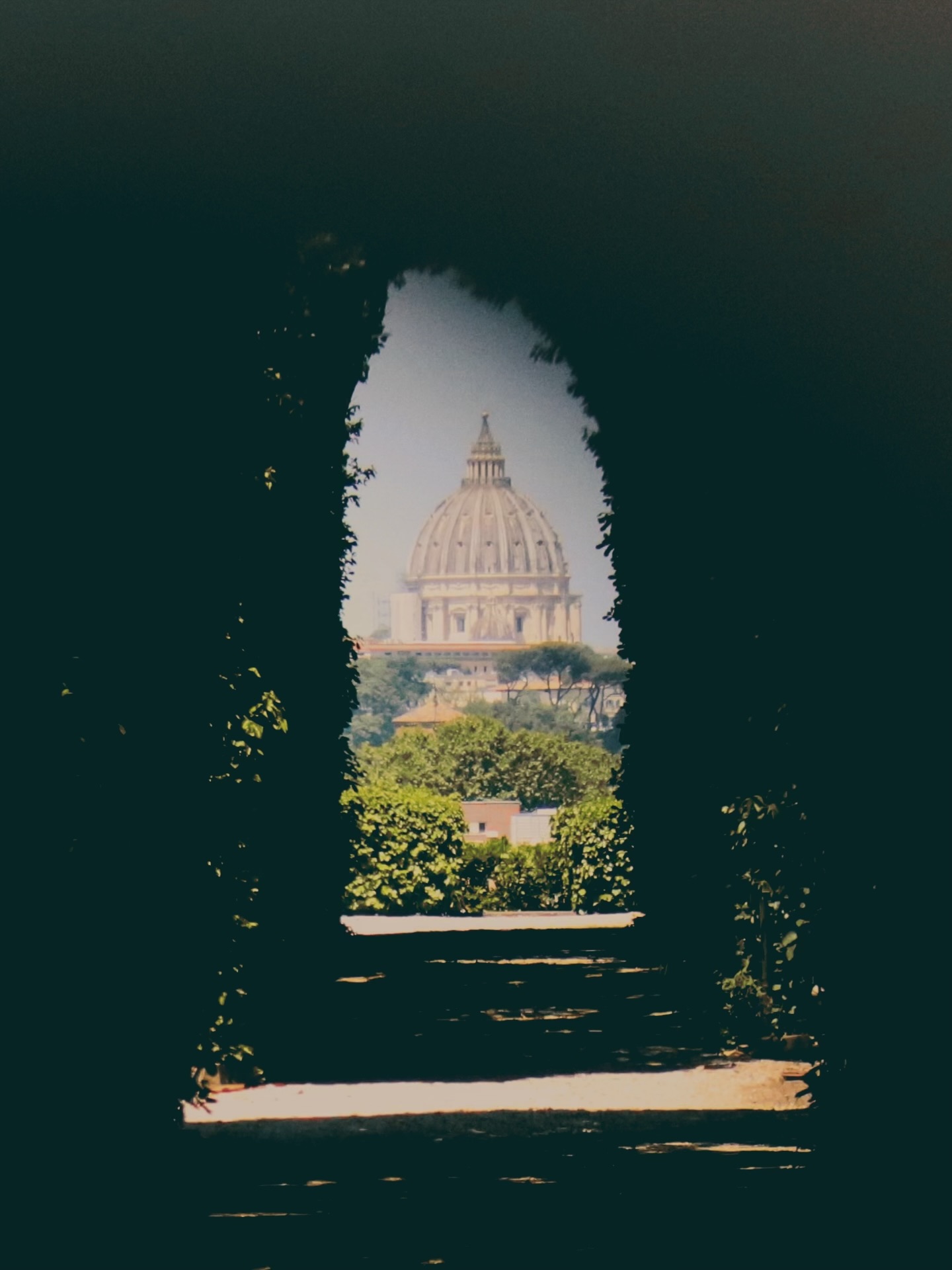
In practice, his built work is far more limited. His most notable project, Santa Maria del Priorato in Rome, demonstrates what happens when a drawing must become a wall. At that point, dimension, structure, material, and maintenance come into play.
And then there is the image that visitors look for today when they arrive in Rome — the keyhole view precisely framing St. Peter’s Basilica. It reflects the same instinct present in his drawings, but here it had to be executed.
The difference is not talent. The difference is the resistance of reality.
Today, we have tools that replicate what Piranesi once did by hand, only faster and more accessible. The difference is that drawing was understood as vision, while rendering is now often presented as resolution.
This is not a local anomaly. The same dynamic can be observed from London to Dubai, from Milan to New York. The difference lies only in the scale of the market and the tolerance for error. The demand for fast solutions is global, as are the consequences of reducing the process to a visual outcome.
Professional practice follows a different order. Before the first line is drawn, the feasibility of the idea is examined. Dimensions are checked against available formats, materials are selected based on performance rather than appearance, and installation, transport, maintenance, timelines, and budgets are considered. Only when constraints are clear does form begin to make sense.
A large conference table offers a clear example. In a digital model, a monolithic surface appears straightforward. In production, such an element rarely exists as a single piece. The solution requires segmentation and a structure that must be anticipated in advance, and joints become a design task rather than a flaw to be concealed.
If this is not resolved in time, the project enters a sequence of corrections that alter the initial idea and increase cost.
Materials introduce another level of responsibility. A surface that appears homogeneous and refined in a render must withstand impact, heat, moisture, cleaning, and continuous use. At that point, selection is no longer aesthetic but performative. HPL, compact boards, natural veneer, or lacquered MDF are not interchangeable, but systems with distinct constraints in fabrication, detailing, and durability. These differences determine how an object will perform after a year, not just on the first day.
Details that rarely appear in a render, but define the space, require equal precision. Edge ergonomics, power access, cable routing, installation, tolerances, transport, and delivery all shape the project.
When this part of the process is overlooked, corrections shift into execution, where they become the most expensive. Decisions made for the image are then reconsidered under pressure.
Without an understanding of materials, production, and coordination, a render remains a simulation. A simulation carries no responsibility for what happens in space.
Professional education and practice exist to bridge this gap. Not as a formal requirement, but as a method of work. Asking questions before drawing answers. Testing assumptions before turning them into form. Taking responsibility for decisions that must endure.
Interior design is not a sequence of images. It is a system of decisions shaped by constraints. Its quality is measured not by visual persuasiveness, but by the stability of the solution over time.
Rendering comes at the end of the process as confirmation that a solution can exist. When that order is reversed, a project appears complete before it has begun. Reality then demands another answer.
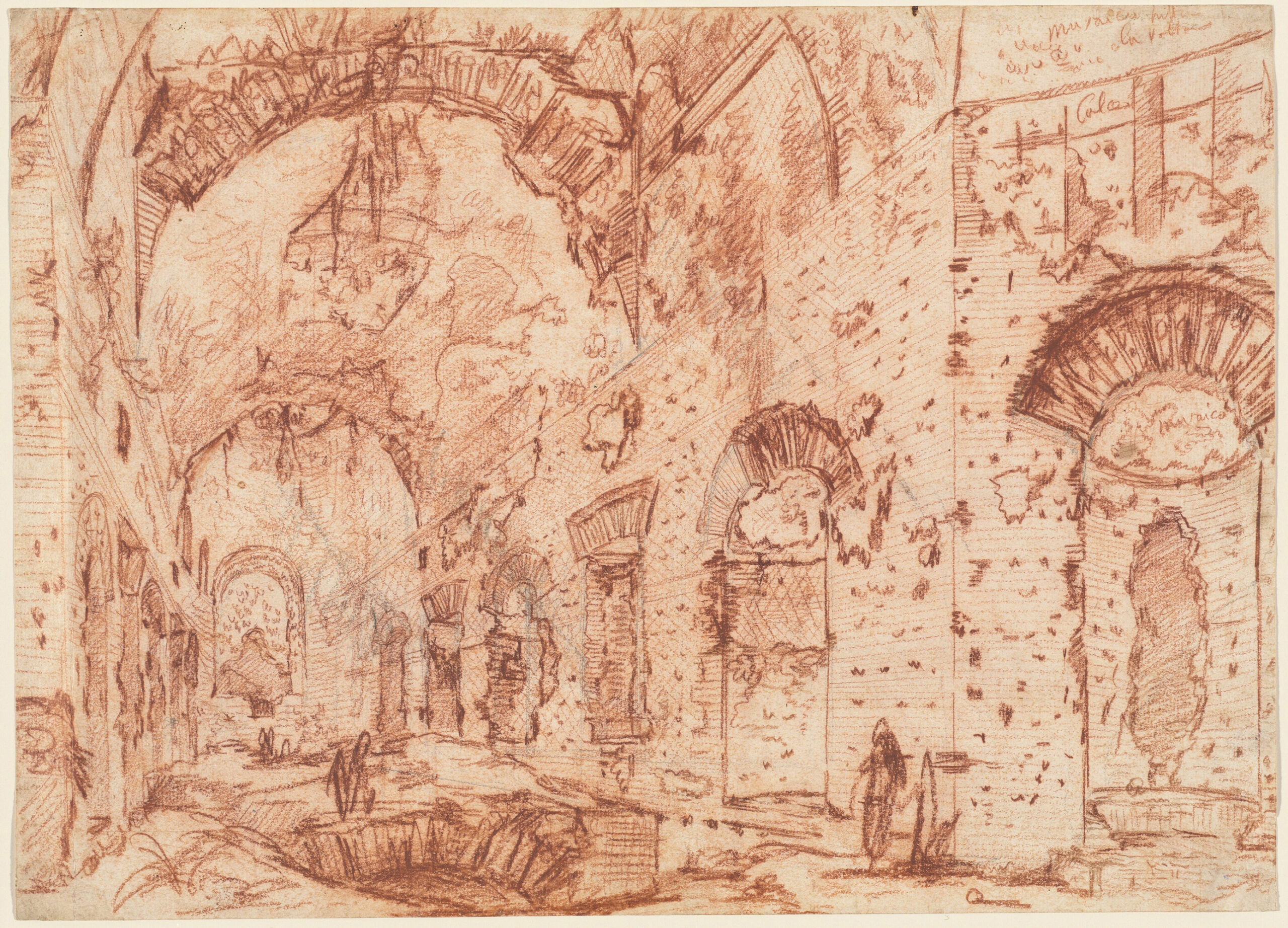
A space that must exist has to resolve everything.
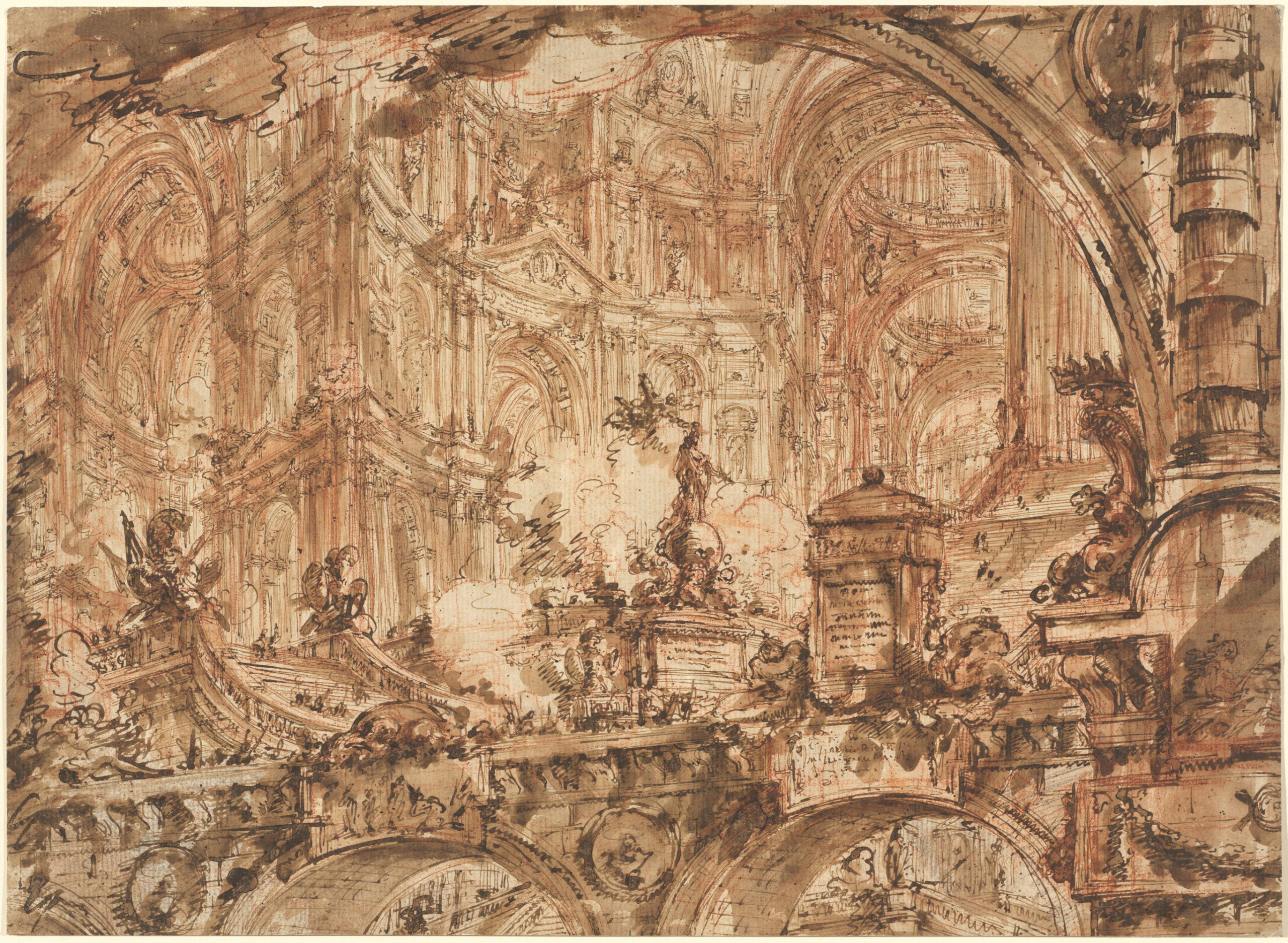
The problem arises when tools are presented as a substitute for education.
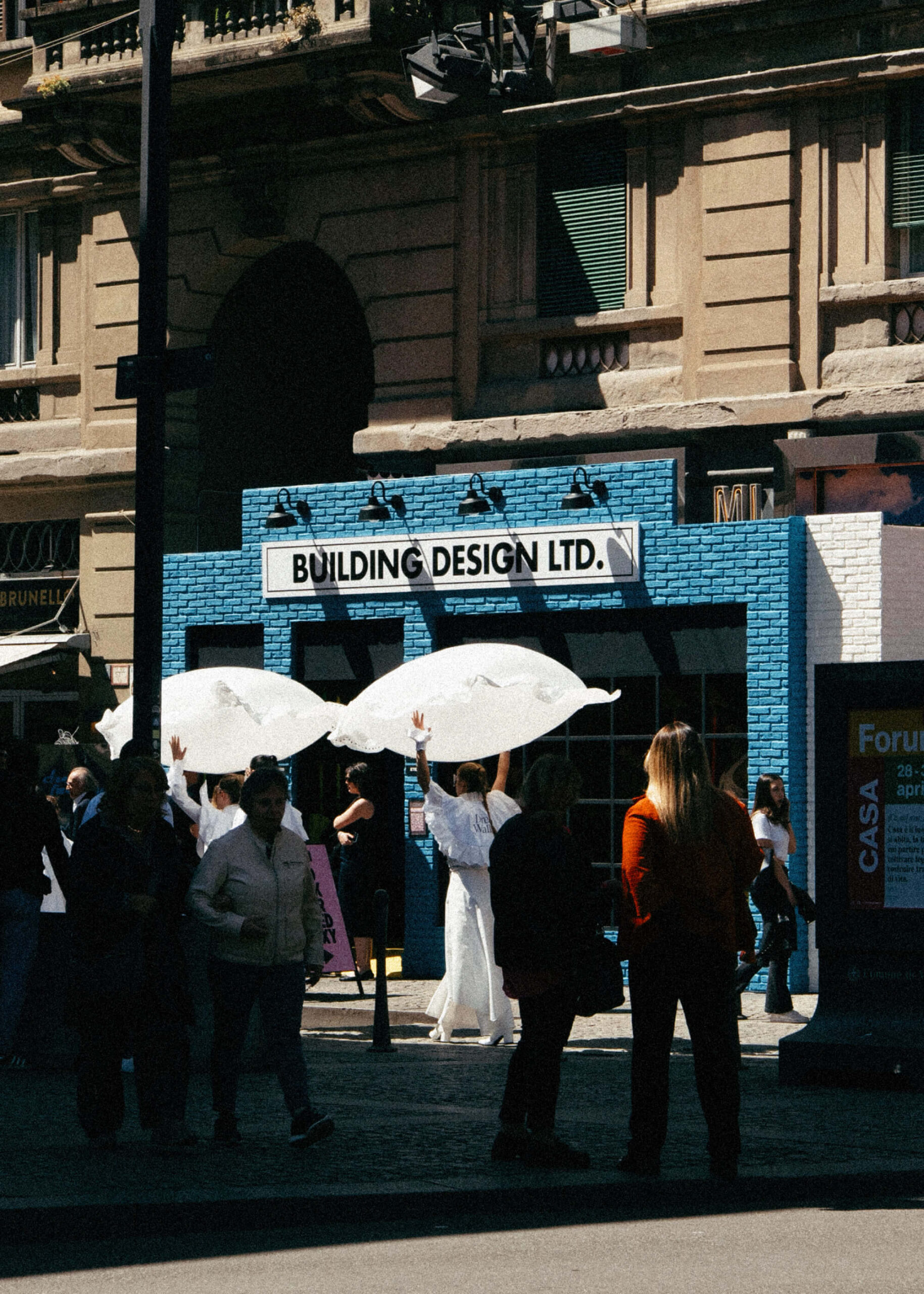
MILAN DESIGN WEEK: WHO FORGOT THE WORD ''FAIR''?
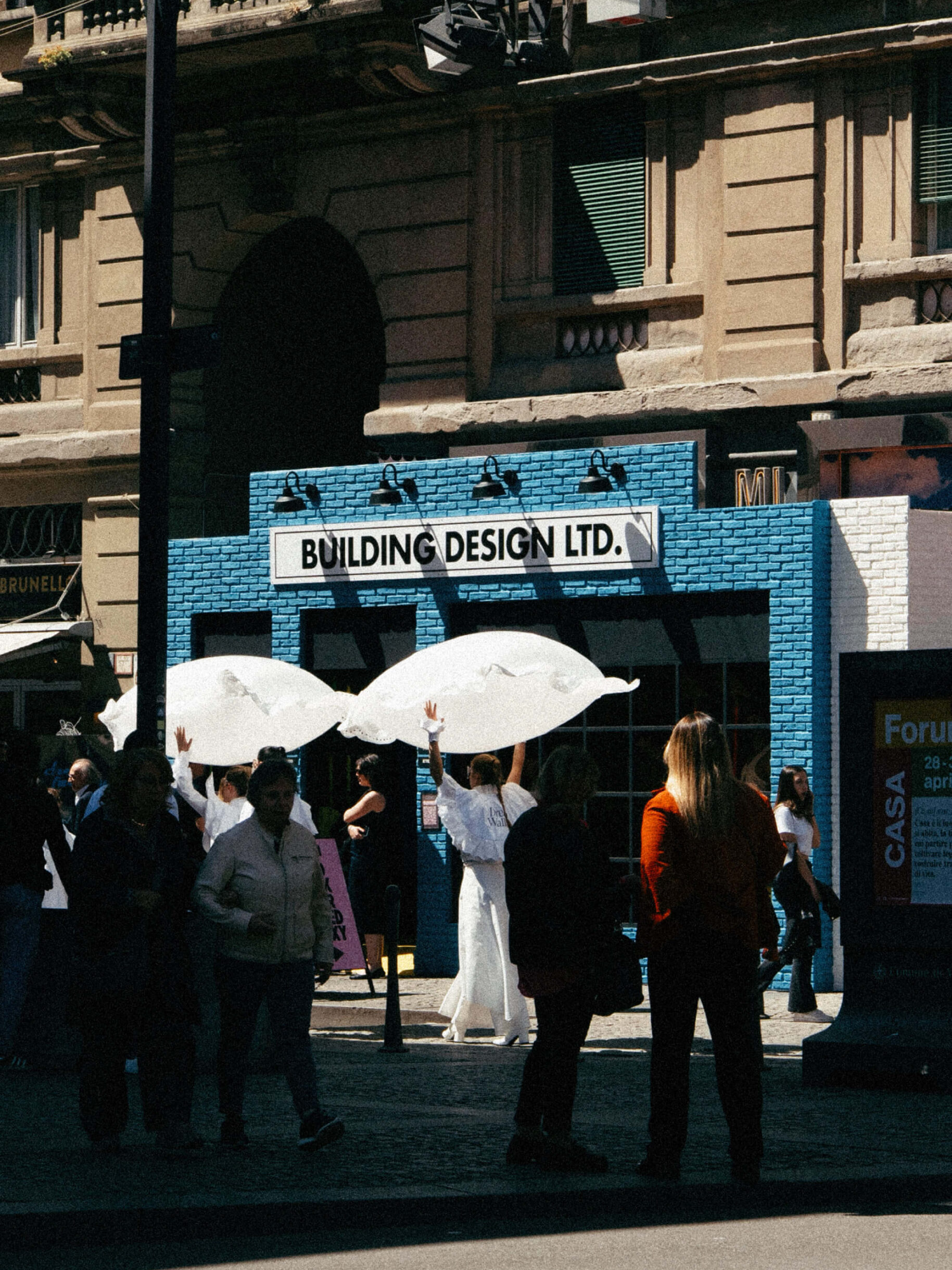
It wasn’t always like this.
Mozart, Napoleon, and Marchesa Acerbi have all been issued QR codes, while Maria Theresa holds a press pass. The Empress, however, has cancelled her visit to Milan. You already know why. In this city, things have always been resolved through presence, not announcements. They stood and observed, not because they fail to understand Milan in 2026, but because none of these palaces were ever built or visited in the way they are now being explained. The people at the entrance seemed more serious than court ladies, and the lines, which they briefly mistook for the plebs, appeared more organized, and perhaps even more important than the aristocracy itself.
That’s where the comedy of errors begins.
A fair is a simple thing, and maybe that is precisely the problem. Simple things are the easiest to forget once we bury them under meanings they were never meant to carry. The word fair, whether we call it foire, messe, fiera, bazaar or market, means the same thing: a meeting between seller and buyer, a place where an object comes before a person with a clear purpose: to be chosen and to begin a life beyond that space. It is not a romantic definition, but it is a precise one, and that is exactly why it matters to say it out loud before entering Milan during the week when that simplicity almost disappears.
Milan Design Week is a name that allows this clarity to dissolve. It contains everything, and today that “everything” truly exists: fair, exhibition, installation, architecture, fashion, brand activations and nightlife. That breadth feels open and seductive, but in practice it erases the differences between things that serve entirely different purposes. Once everything is placed under the same elegant parasol, one that conceals more than it protects, everything begins to behave as if it were the same, and what used to be the center becomes just one option among many.
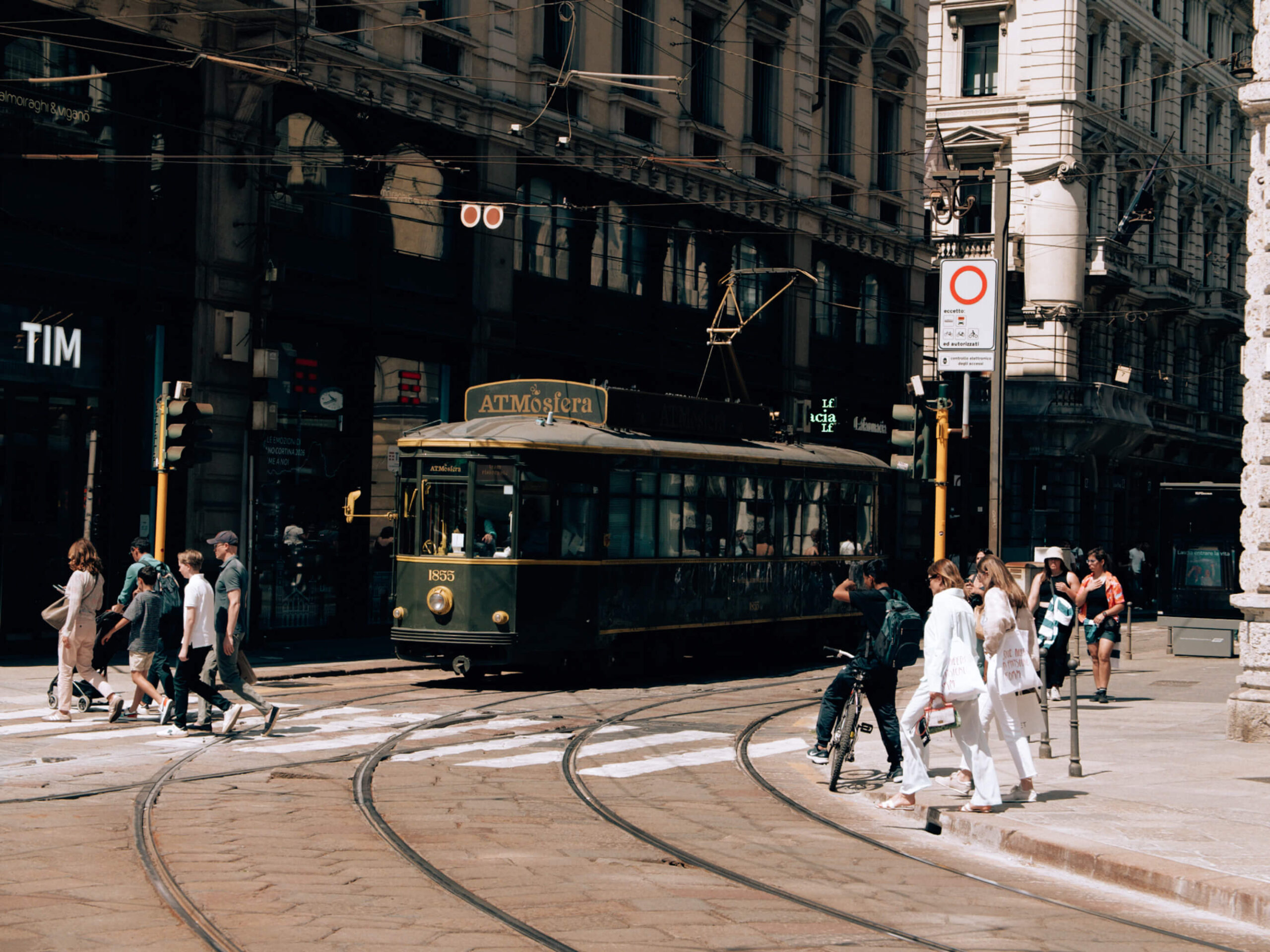
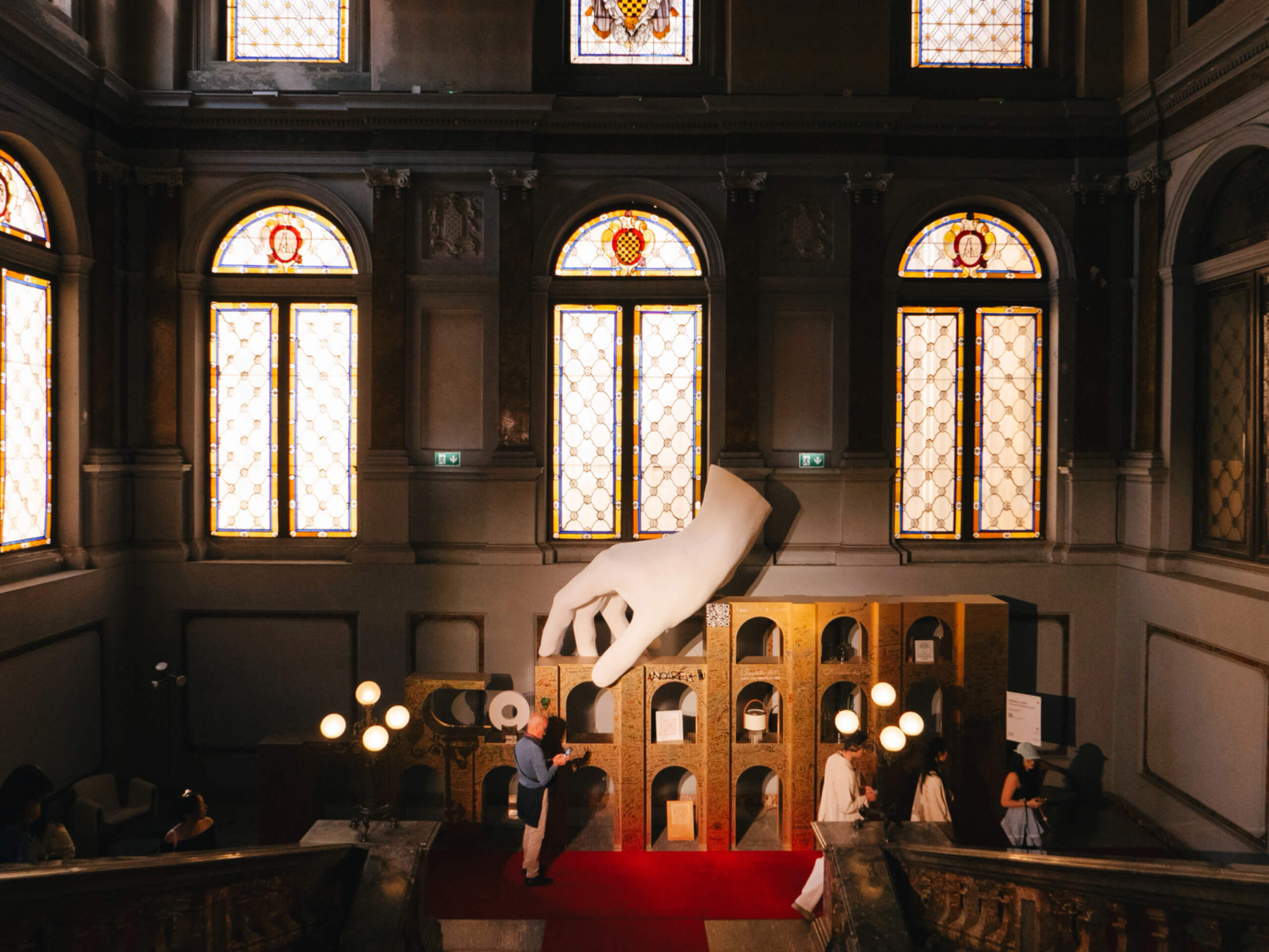
Milan does not ignore this. It remembers. Palazzo Litta is not a space that tolerates superficiality without consequence. Built in the mid-17th century as the residence of Count Bartolomeo Arese, it was a place of presence and encounter, not spectacle. Here, a young Mozart worked and performed during his Milan years, while Napoleon later used the same city as a political platform to establish an order meant to outlast the moment. In other words, people came to Milan with purpose.
Today, in front of those same entrances, conceptual tributes to the fashion industry unfold, often through carefully constructed collaborations that online audiences already understand and accept as a desirable form of life. In front of those same spaces, lines form. Long, precise and disciplined, they wrap around façades and courtyards like a temporary architecture whose only function is to organize waiting. People stand looking at their phones, checking the next location and planning their movement. The space around them becomes a backdrop, and entering stops being a result of interest and becomes a consequence of the fact that everyone is already inside.
That shift reveals how much the underlying logic of this event has changed.
Inside Palazzo Litta, Line Ghotmeh’s installation attempts to return the space to its original function. It does not add a layer, it removes excess, almost biennial in its restraint. Materials are quiet, movement is clear, and light works without needing to impress. In such a space, staying happens naturally. At one point, you come across students from Politecnico di Milano standing next to their work, without the need to explain it or sell it. The scene feels unusual precisely because it shows a relationship between work and space that does not depend on immediate attention.
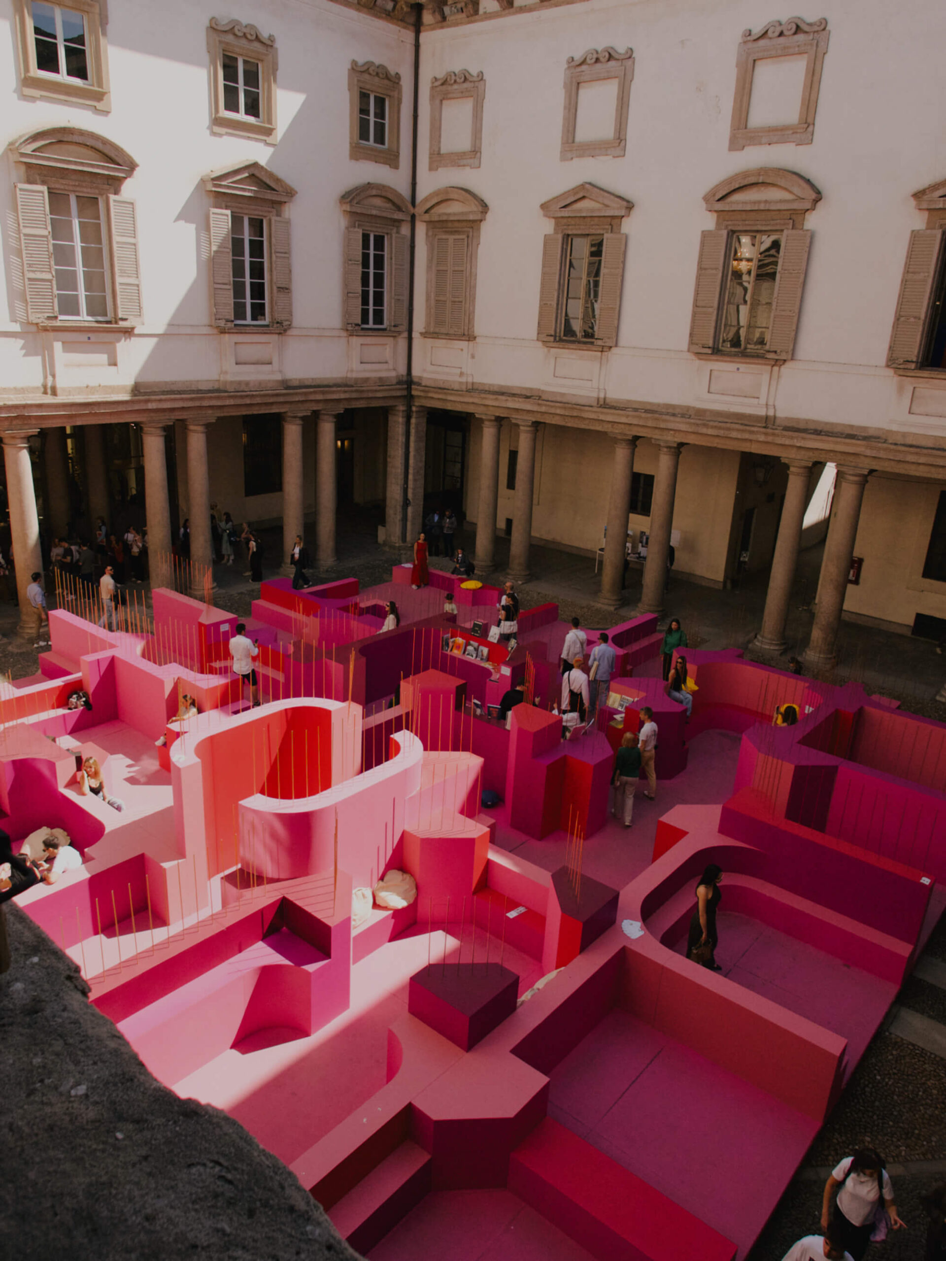
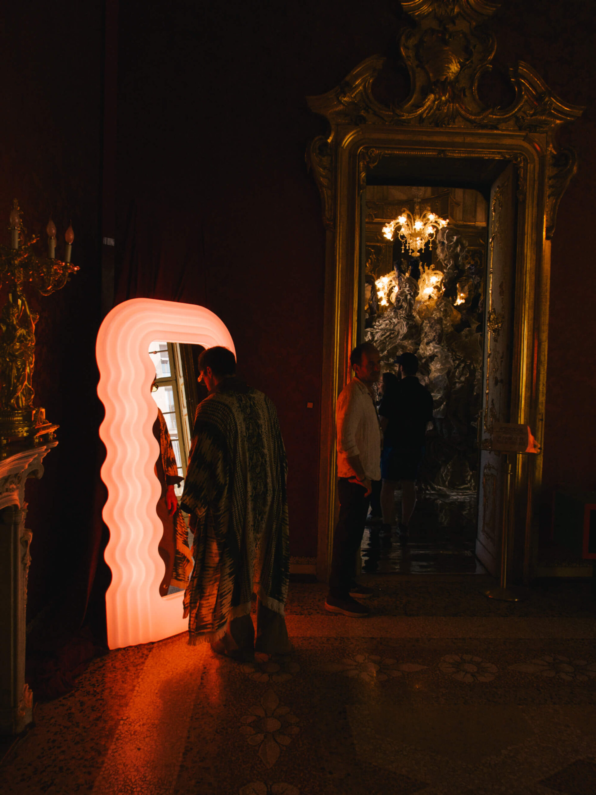
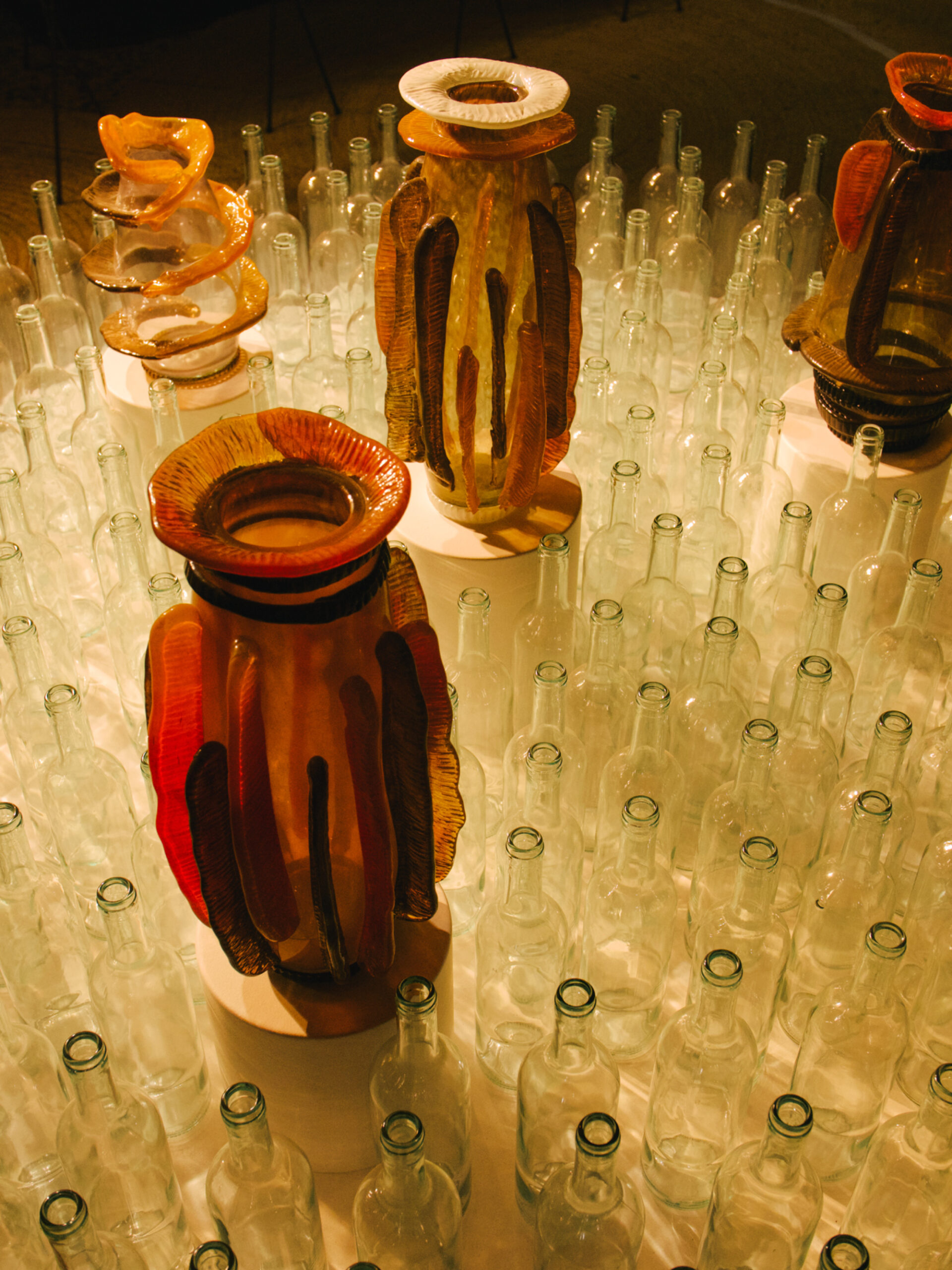
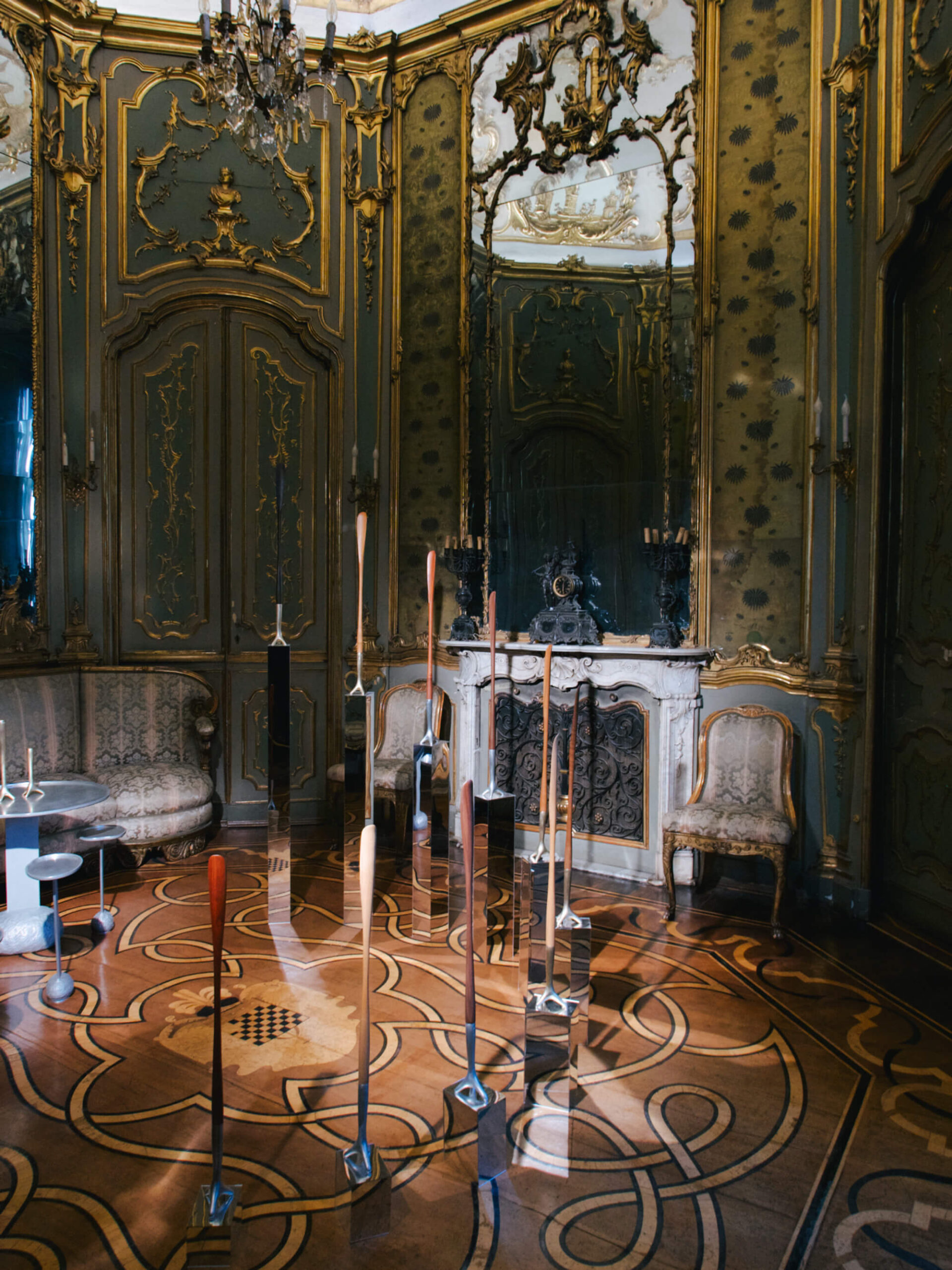
A few minutes away, in what Milan has long called the Devil’s House, the rules are different. Palazzo Acerbi, tied to Ludovico Acerbi, the aristocrat who continued hosting lavish dinners during the plague while the city was dying, carries a story that still feels exaggerated today, but was entirely real at the time. His behavior was not just excess, it was a complete rupture with reality. Over time, the public turned him into a devil-like figure, a man who did not belong to the same rules as everyone else.
Today, in that same space, you encounter a new version of the same logic. Kelly Wearstler’s installation for H&M home works perfectly on the level of image. The space is precisely styled, the composition controlled, the materials aligned, but the essential action is missing. You cannot sit. I tried. It is not allowed. At that moment, the object stops being an object and becomes scenography, an idea that lasts exactly as long as the frame in which it is captured.
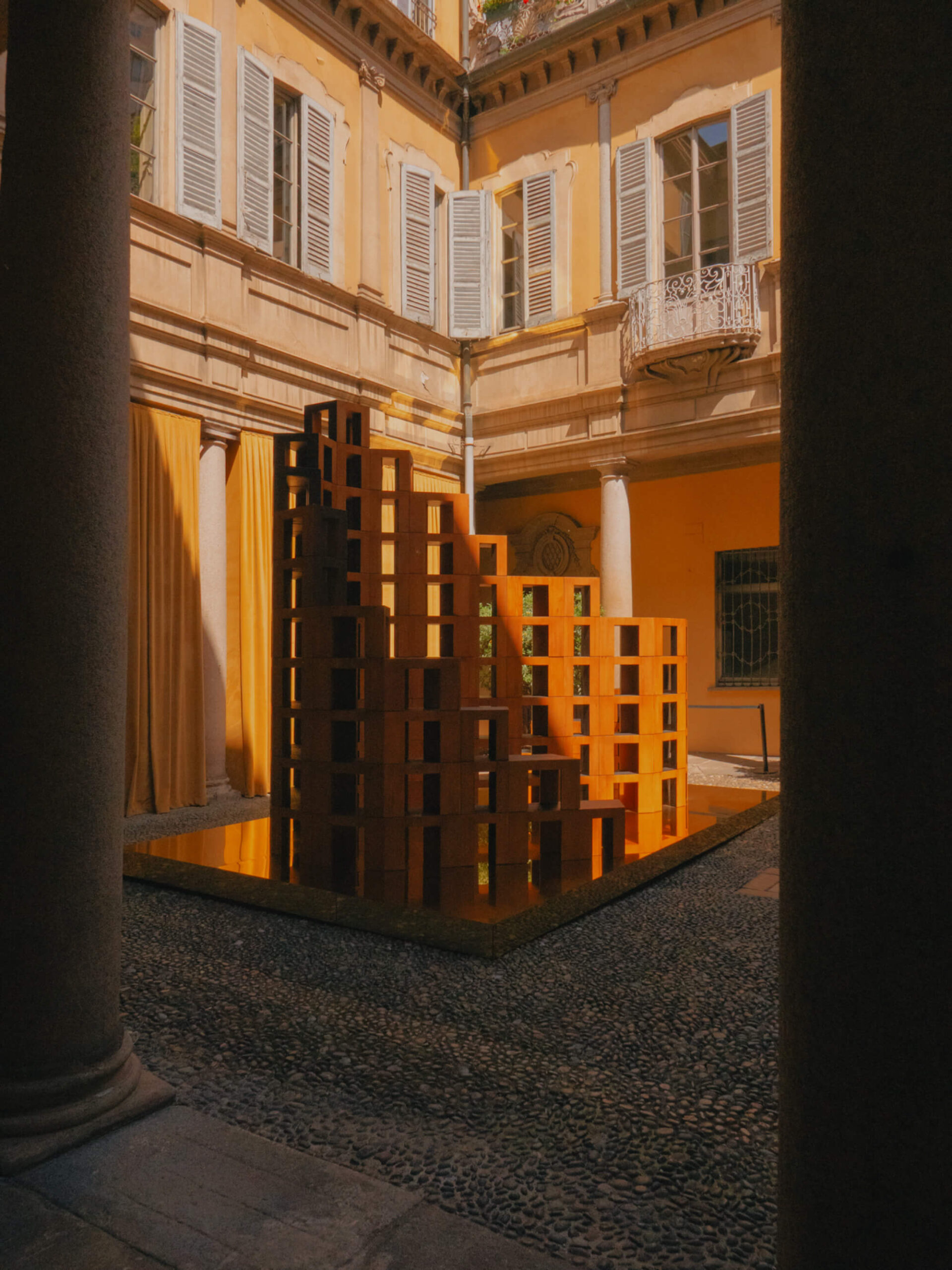
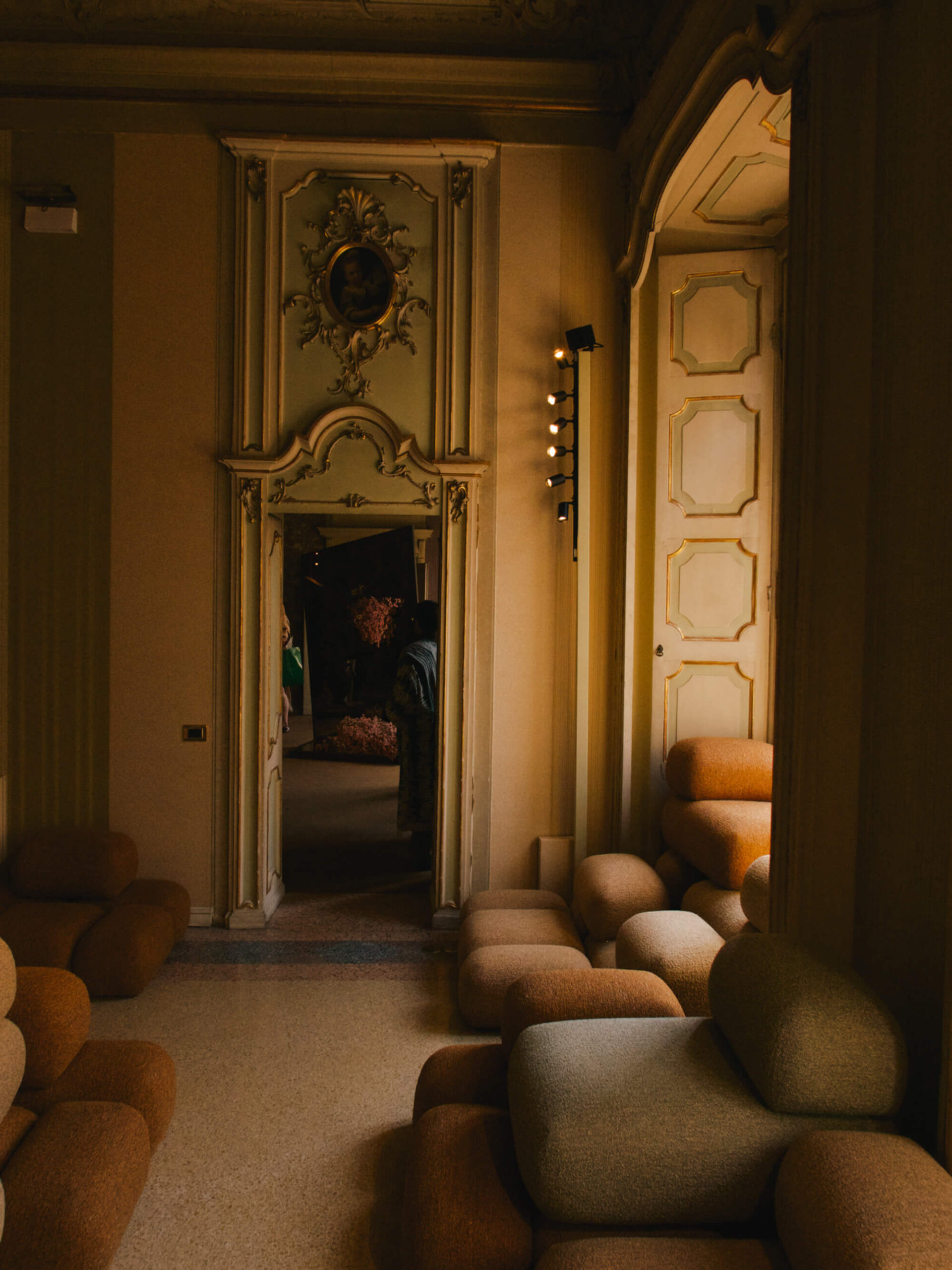
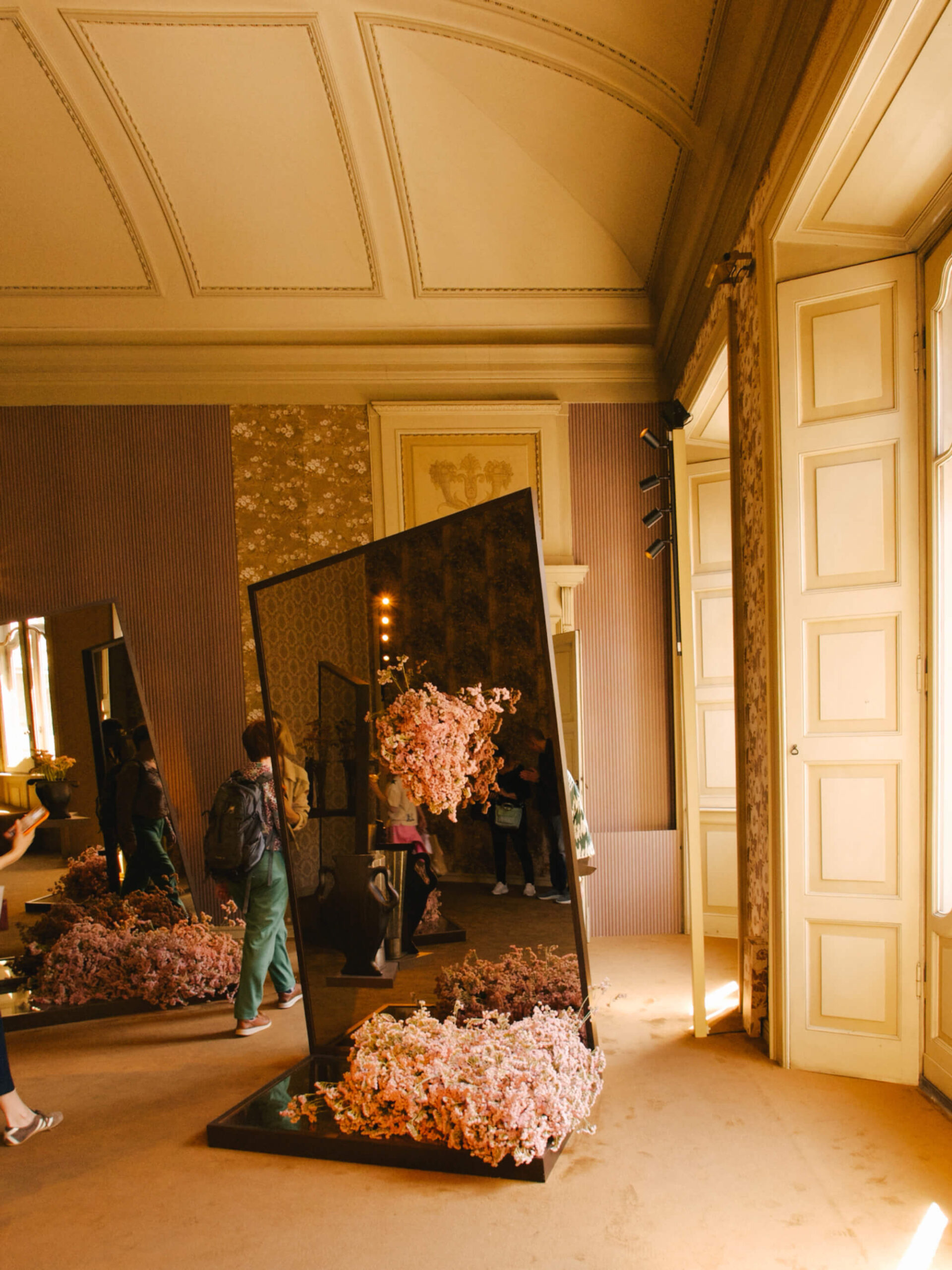
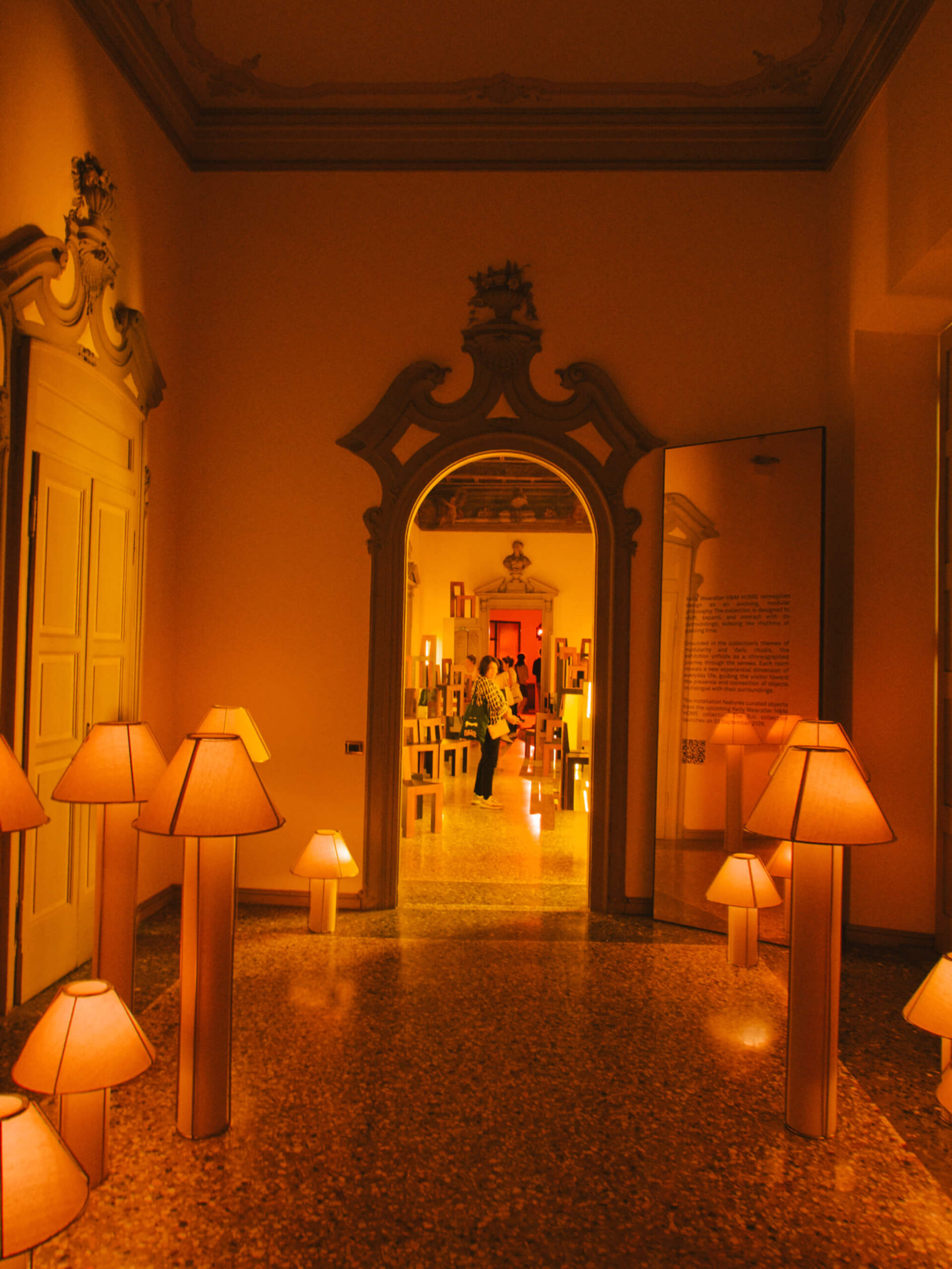
That is why showrooms like Cassina and Flexform, among the key names of Salone del Mobile, feel almost subversive. At Cassina, people sit without needing to justify it, testing proportions, leaning into materials and checking how an object performs in real contact with the body. The need for spectacle is deliberately absent. Sometimes, it is enough just to walk up and down a set of fur-covered stairs.
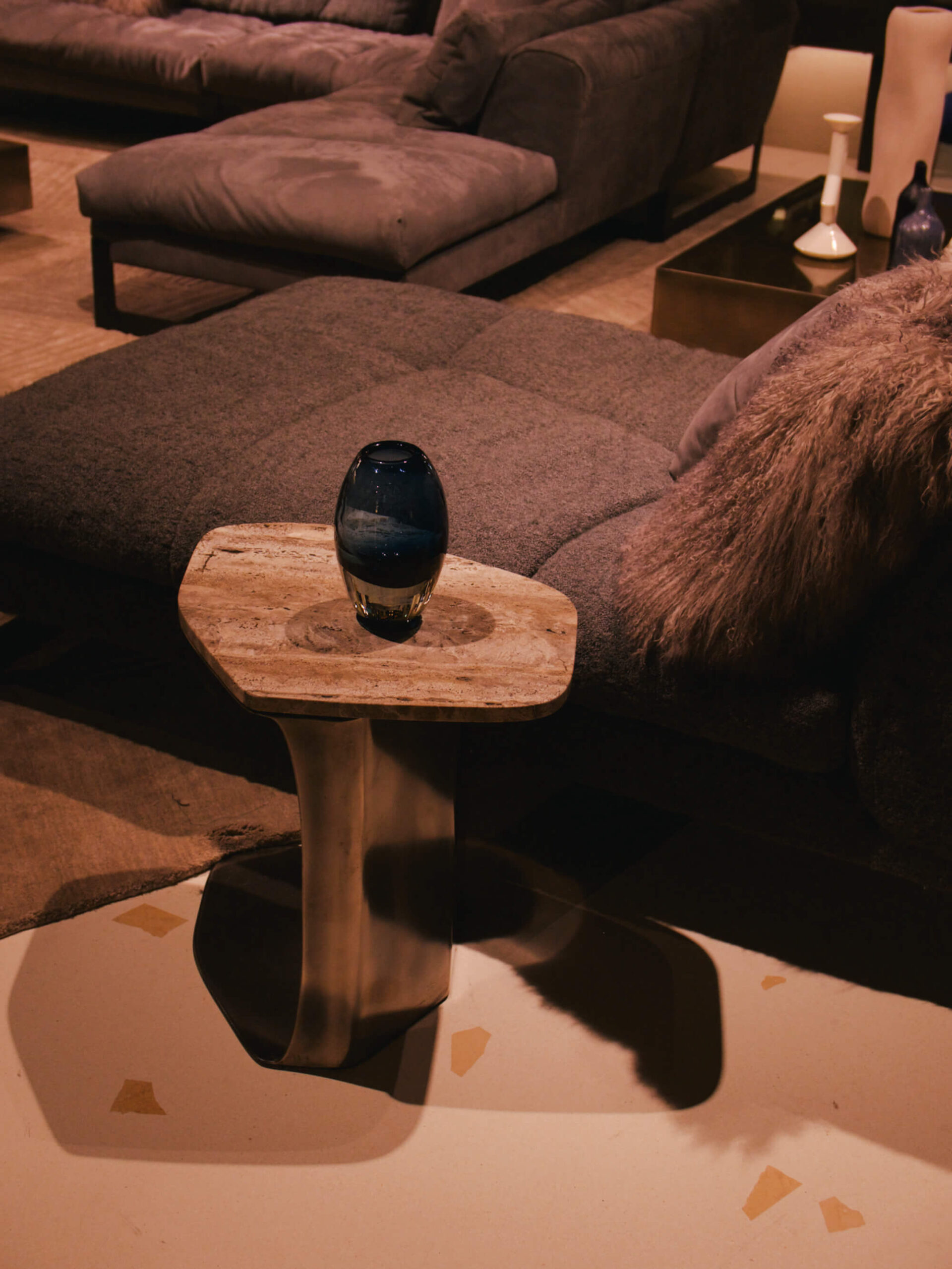
The Private Life of Objects, through Flexform’s concept, further reinforces this logic by placing objects in a way that asks for time rather than an immediate reaction. Their sofas and other elements don’t rely on first impressions, but prove their value through use.
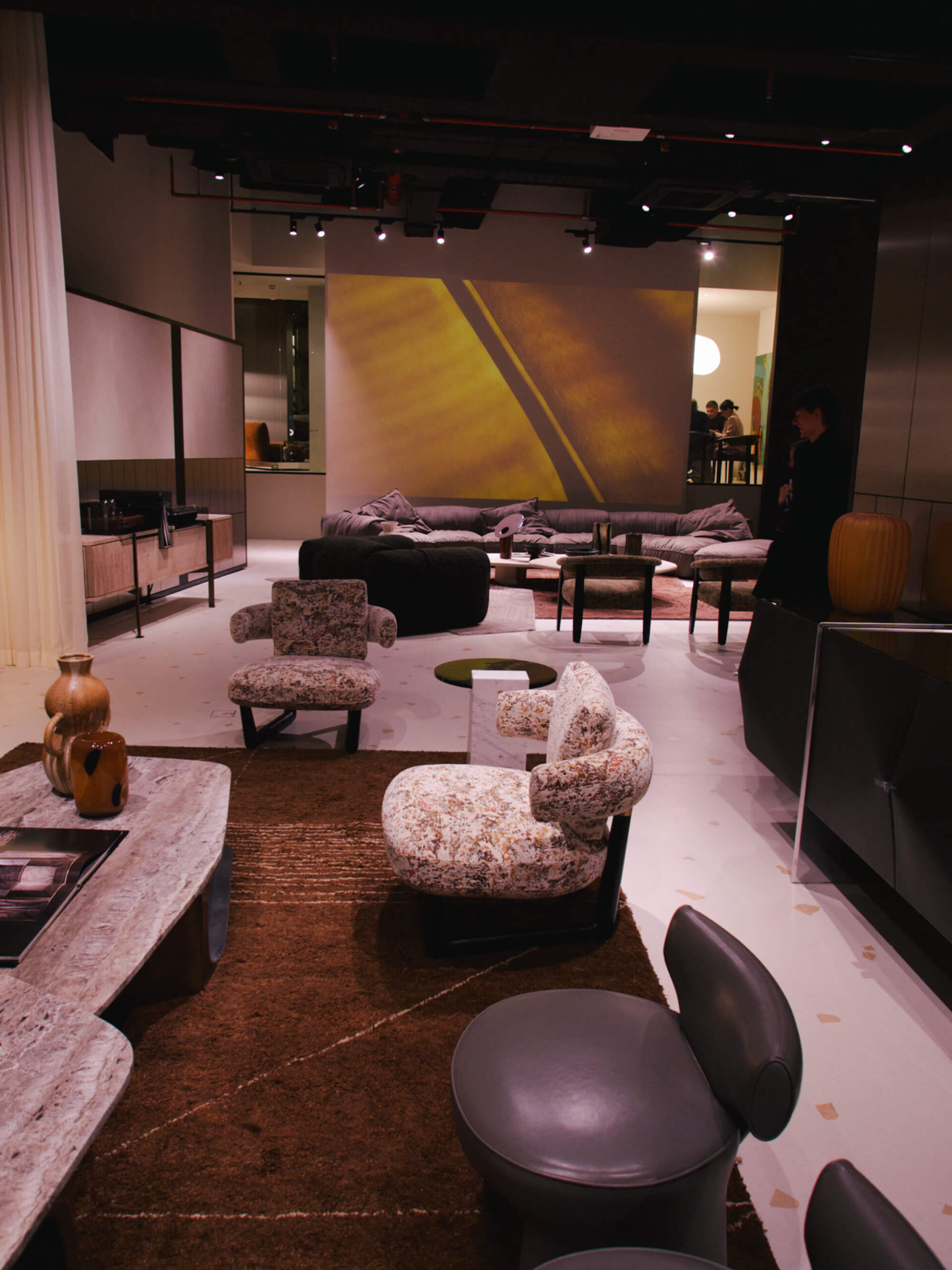
Baxter, one of the brands redefining contemporary luxury at Milan Design Week in recent years, takes a different approach in the space of Baxter Cinema. It does not erase the existing interior, it continues it. The collection rooted in the seventies does not feel like a reference, but like a natural culmination of a space that was always meant for experience, not observation. You linger the longest around the console with the turntable. Everything leads you there. When I played Daft Punk, the space clicked. Suddenly, you are no longer looking at things, you are part of them.
That is the difference. It does not try to please you. It holds you. And it succeeds.
Jaipur Rugs, in collaboration with Japanese architect Kengo Kuma, translates architecture into textile in a way that does not demand explanation, but time. Here, I am intentionally subjective, because my experience of Jaipur, the “Pink City,” allows me to read the logic of this brand more precisely. There is a move toward the contemporary, but never at the expense of identity. That is why the people behind this story in Milan feel different. Their work appears where it should, from museums to some of the most notable installations across the city, without the need to impose itself, because it is simply visible. Perhaps this is where what design should do is most missing elsewhere — creating a relationship that lasts longer than a single visit
Outside these spaces, the rhythm accelerates again. Phones become the primary navigation tool, QR codes dictate movement, installations follow one another like sequences, and people move from one space to another without stopping. It is as if there is an unspoken agreement not to check whether an object works, as long as it looks like it might, and not to question what is being seen, as long as everyone is looking at the same thing.
Our historical guests from the beginning understand this quickly and step out of the line. Only someone else continues forward instead of the Empress, thanks to a press pass. The system continues to function without interruption. Seamless. Almost too efficient.
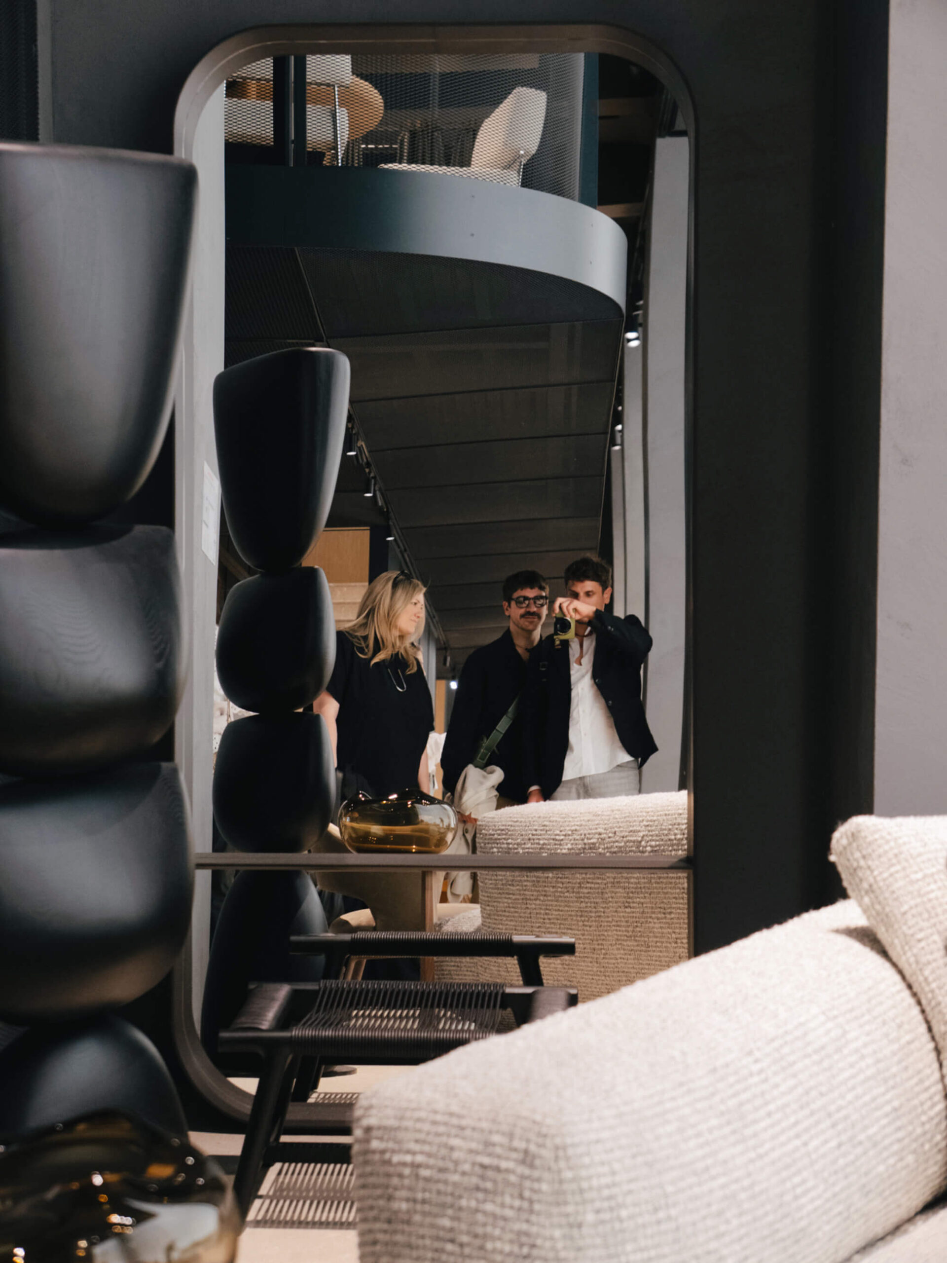
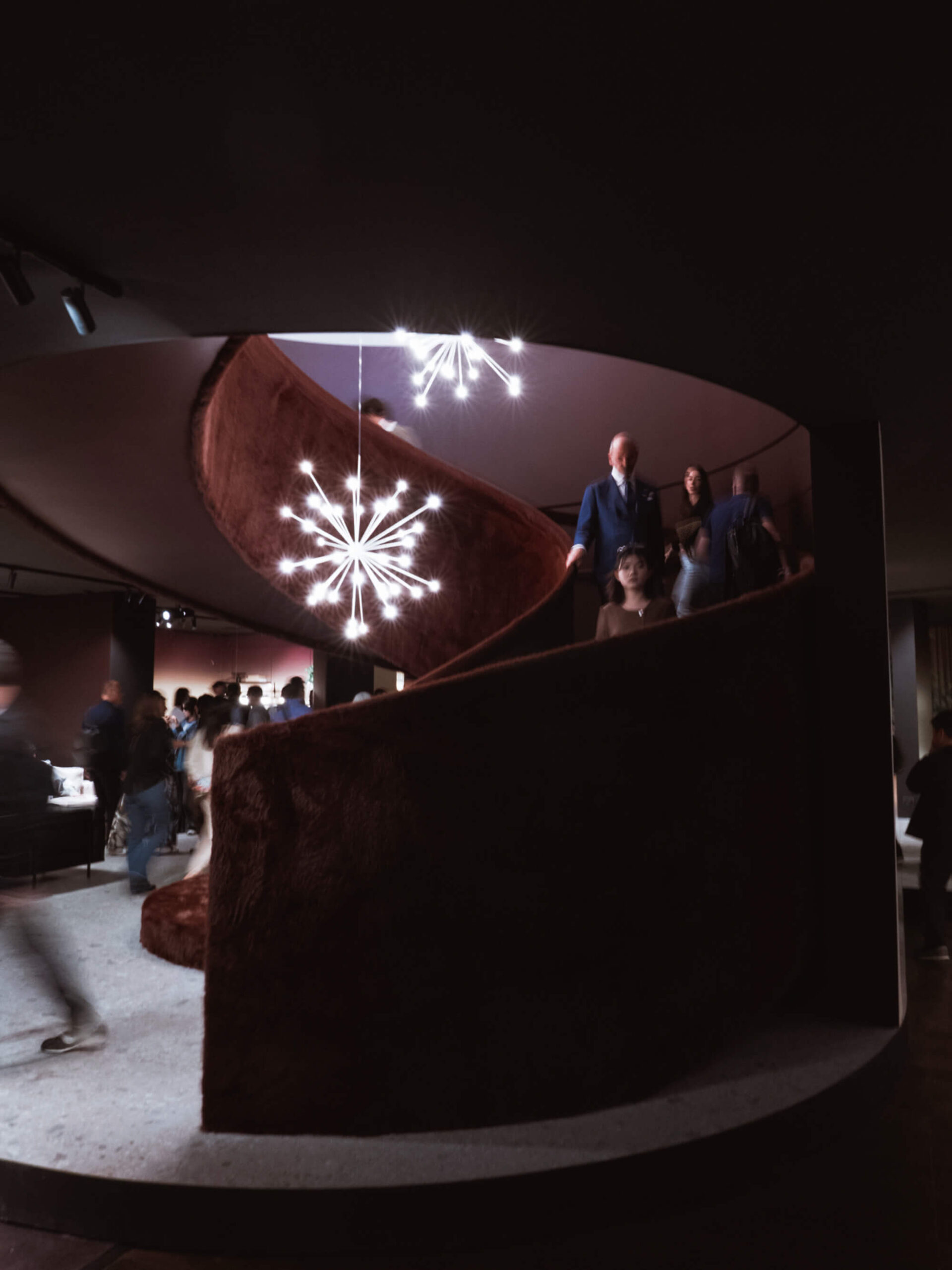
In the evening, the scene moves to Bar Basso, one of the iconic spots of Milan Design Week. The lines form again, the same pattern, only now with ice in a glass. At that point, it becomes clear that the problem is not influencers or fashion. They are doing their job precisely and efficiently. The problem is that design has accepted the same rules and begun to measure itself by the same criteria.
While all this is happening, what benefits the most is what comes before and after: the market. During these days, it functions better than ever, not by accident but by design. The rules are simple. The greater the demand, the shorter the stay. The faster you move, the more you spend. Someone might call it a side effect. Here, chance does not feel convincing.
In that context, Salone del Mobile feels like a separate part of the city. It is farther away, it requires time, and you pay to enter, but precisely because of that it retains a clarity that the rest of the week often loses. It is the most precisely structured part of the event, a place where experience is not accidental, but constructed. The object returns to the center. It can be tested, understood or rejected, and brands do what makes them relevant and sustainable. They position themselves through what they are, not how they look.
Within that space, something emerges that the rest of the city has started to imitate: fair-like, almost museum-like moments, tributes to authors, and a clear emphasis on the designers behind the work. If we want younger designers to have greater value and visibility, this is the part of the week that cannot be ignored. Criticizing it without taking responsibility, while pretending we are all part of some abstract event, becomes less a stance and more bad taste.
If the city is a cult of brand, Salone is a cult of authorship. And that is its greatest strength. Here, you know who stands behind the work. And this time, structure did not suffocate content. On the contrary, it allowed it to exist.
In the end, the guests left. The lines dispersed. The music stopped. The lights stayed on a little longer than they should. Someone closes the door. Someone checks if everything is finished. There is no one left in the spaces. Only the objects remain, still there, waiting for someone to actually use them.
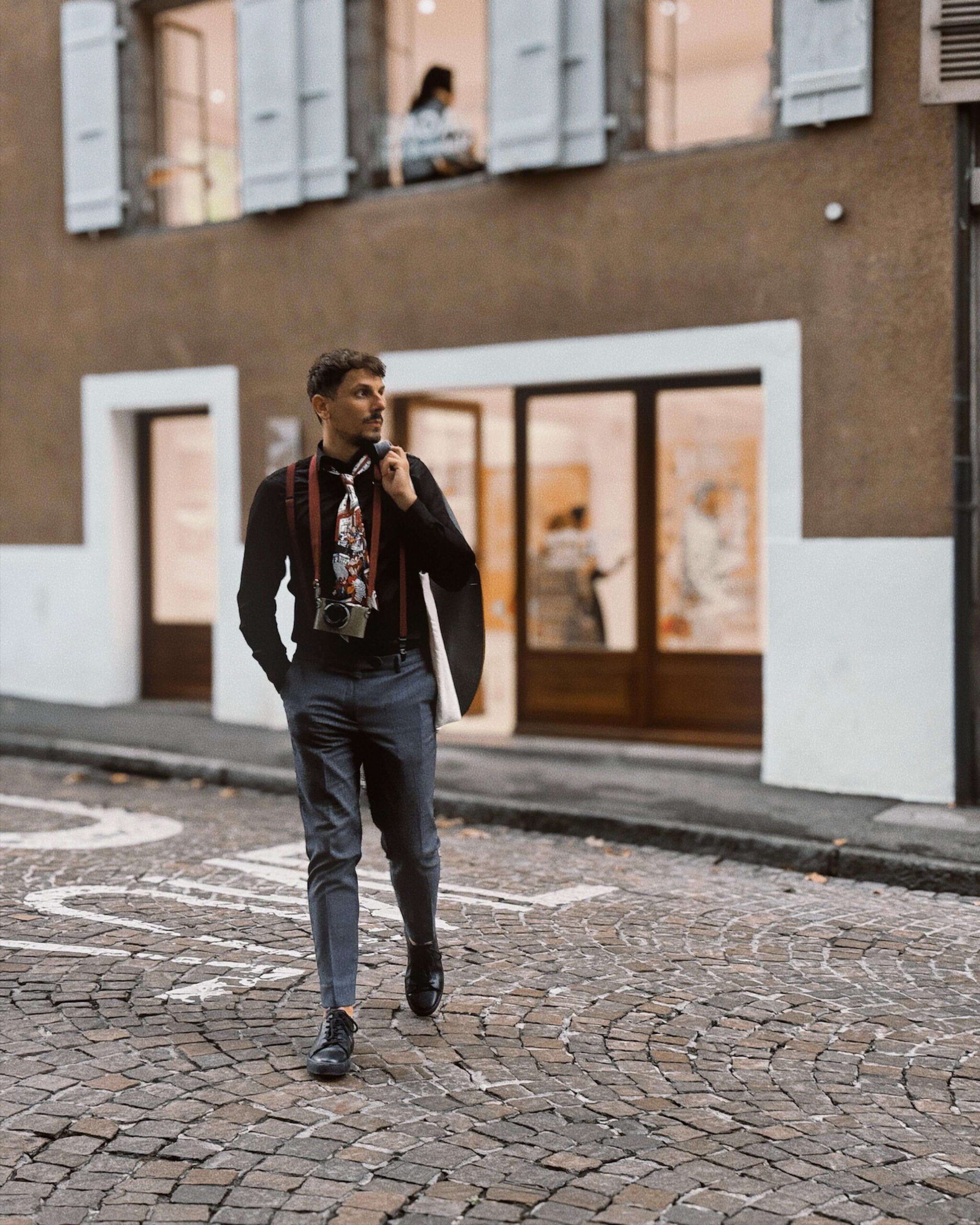
Don't Expect An Architect To Save The World
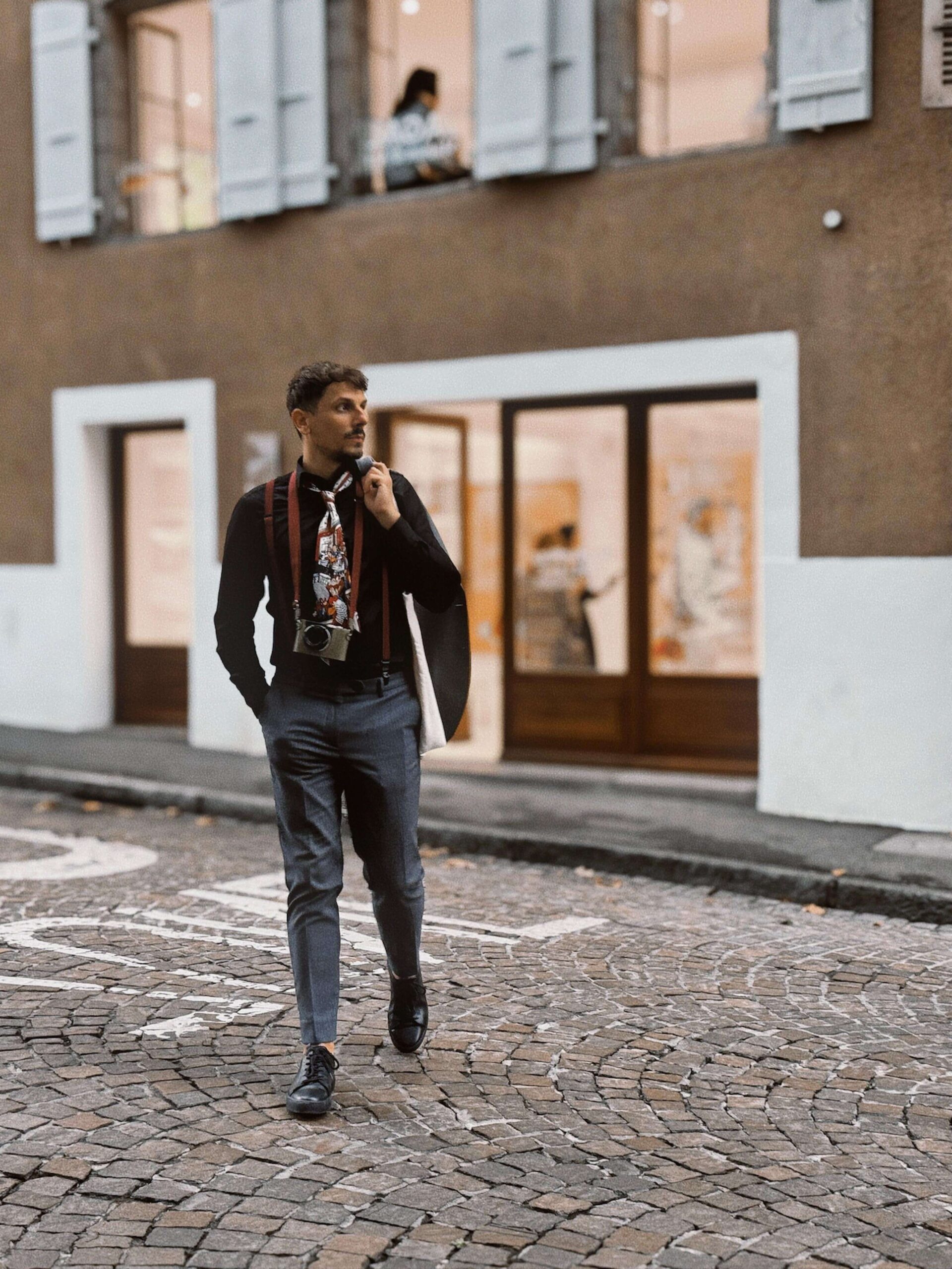
There’s one mistake people keep making when they talk about architecture.
When a city becomes too loud, when apartments start feeling too heavy to live in, when everyday life begins to resemble survival, people suddenly look at the architect as if they were the last authority on sanity. As if an architect should walk in, open their arms, and say: “Here. I fixed it.”
No.
Don’t expect an architect to save the world.
Not because they don’t want to, but because the world doesn’t work like a project. The world isn’t a floor plan. The world doesn’t have a facade you repaint and the problem disappears. The world is a system of small habits, wrong choices, speed, and exhaustion. And every crack in it becomes visible exactly where we try to hide it most, inside the spaces we live in.
And then we ask architecture for a miracle.
We ask for “wow”.
We ask for trends.
We ask for interiors that look like screenshots. Something that gets filtered, posted, liked, saved, and forgotten.
As if a space exists only to become content.
And that’s where my protest begins.
My protest is against beauty without intention.
Against interiors that exist only as a backdrop.
Against spaces that perform meaning instead of holding it.
Against design that feels like a costume, not a character.
That is why I built a way of working that doesn’t start with a Pinterest image, but with a process you can actually trust.
Because a space isn’t decoration.
A space is how you breathe.
If your walls feel like pressure, you might not know how to explain it, but your body knows.
If the light is wrong, your entire day shifts, even if you can’t name the reason.
If the layout is aggressive, you become tense for no reason.
If everything is cluttered, your mind has nowhere to rest.
And then you realise something uncomfortable. A space shapes you, even when you think you’re the one in control.
That’s why I’ve always found this idea of the architect as an artist who creates a spectacle strange.
An architect is not here to create a spectacle.
An architect is here to create conditions.
To create normality.
To give you a space where you can return to yourself. No explanation. No effort. No performance. No pressure to be someone.
And that is not a small thing.
In real life, the most meaningful luxury isn’t marble. It isn’t custom details. It isn’t brands.
Luxury is when a space asks nothing from you.
When you don’t have to earn it.
When you don’t have to prove yourself.
When you don’t have to be “on a certain level” just to exist inside it.
A well-designed space carries a kind of quiet.
And that quiet means someone thought beyond form.
They thought about rituals.
Movement.
Views.
Shadows.
Where you drop your things when you get home exhausted.
Where you sit when you don’t feel like talking to anyone.
Architecture is not the salvation of the world.
Architecture is a way to stop the world from spilling into your home.
To keep the noise at the threshold.
To break the speed of the day against a wall placed exactly where it should be.
To let light enter like a friend, not like a spotlight.
And yes, you can create a space that looks perfect on camera.
But real architecture isn’t tested through a lens.
It’s tested on a Tuesday at 4:40 PM.
When the day has been bad.
When everything has piled up.
When you don’t know what to do with yourself.
And then you walk into your space and feel it. I can be here.
That’s the point.
And when I say all this, it sounds philosophical, but it’s brutally practical.
Because the biggest chaos in projects isn’t wall colour. It isn’t tiles.
The biggest chaos happens when no one knows where it’s going, how long it takes, how much it costs, or what the process actually includes.
That’s why I created a new pricing structure and service model, so everything is clear from the start.
You’ll know exactly what I do.
How long it takes.
How much it costs.
And where the boundaries are.
A space isn’t built on improvisation. It’s built on calm.
And no, don’t expect me to save the world.
Expect me to build one small, precise part of it that no longer falls apart.
A space that isn’t a lie.
A space that makes sense.
I don’t ask architecture to save the world. I ask it to stop lying about it.
And if we’re looking for “salvation”, let it be this.
Not saving the planet through big words, but saving a person through small, precise things.
Through a space that doesn’t swallow you.
Through light.
Through restraint.
Through calm.
I’m publishing my pricing publicly so architecture stops being done on guesswork and starts being done responsibly.
The service model is now live.
If you need calm instead of improvisation, the pricing is available.
Everything else is an imitation of life.


NOT ANOTHER WHITE LOTUS
The greatest form of luxury is when good design makes you feel like you can do everything and absolutely nothing.
“All I care about is that it is clean.”
That is the famous line of many travelers who get lost scrolling through booking platforms or trying to justify whatever some agency arranged. But when I say clean, I do not mean vacuumed or perfumed. I mean clean as in true. When a space tries to be nothing more than what it is, and yet gets everything right. Not sure what I mean? That is fine.
I do not believe in trusted formulas for a perfect vacation. A beach, white sand, turquoise sea – we all know that postcard. But what truly stays with you, what remains in your body after everything else powers down, is this:
Where you slept. Where you woke up. What you saw first. Where you had your morning coffee. And who told you good morning.
Travel begins when you wake up, not when you land.
Most people do not connect interior design with travel. But your senses react even when your brain does not register it. The scent of wood, the feel of the sheets, the way sunlight touches your face – that is what stays. Sometimes as a gentle unease. Sometimes as the reason you come back.
This resort is not by the water because its luxury does not live in turquoise waves.
This view from the top of the hill changes your relationship with the horizon. You are above, but not removed. It shifts the tone of your journey.
From observer, you become participant.
Let me be specific this time. The place is The Pavilions Phuket.
Location makes all the difference.
It is perfectly chosen. Set on one of the highest hills on the island, above Layan Bay, and not on the expected waterfront strip. That changes everything.
You do not hear music from clubs. You hear the wind.
You do not look at the sea to be impressed. You look at it to slow your breath.
White Lotus. No irony.
The stairs leading to the door are not meant to impress.
They are meant to slow you.
Water on both sides and the shadow of the ceiling quiet the chaos you carried with you.
The entrance is the pause between the world and the space.
Architecture here is part of the jungle.
Bamboo, palms, and thick green layers that do not imitate nature – they are nature. Moist air, shadows, and silence feel curated but are not. That is why it all resembles a perfect frame from the series that brought me here.
A place without corporate fingerprints.
You know that moment when a hotel looks the same in Bali and in Mallorca because the designer approached it with copy and paste logic. This is not that.
Privacy is luxury.
Each villa is placed with intention. There are no shared paths. No forced encounters. You have your own micro universe. You do not feel alone, but you feel protected. And that is when you relax.
For a moment I thought maybe I just arrived outside peak season – although Thailand does not really have one. Then I saw lights glowing from other villas at night, and guests gathering for breakfast.
And I enjoyed that quiet game of hide and seek.
The woven divider in the room is not a wall, but a filter.
It separates without blocking.
It letsthe light move freely, and lets you stay in the frame of stillness.
What is inside matters just as much as what is outside.
The furniture does not dominate.
Everything is low, soft, and quiet.
The bed linen is calm.
The light comes from the side, from the shadows, not from the ceiling.
The walls have no ambition to become art, but they are the perfect frame.
You sit differently here.
Light comes from the side. The wall is not white. The tones are olive and quiet. The gold details are real, but not flashy.
In this kind of space, you are not a tourist.
You are a visitor in someone else’s dream.


The interior is not trying to impress you.
It is trying not to disturb you.
And it works.
Everything indoors leans toward the outdoors.
That blurry line between inside and out is the hardest thing to design.
Here, it feels like it was the starting point.
They succeeded.
And I am saving this as a moodboard for future projects.
Still not sure how to paste a feeling into Photoshop, but I will figure it out.
The space with the restaurant and the pool does not beg for pictures.
It teaches you how to observe without needing to claim.
Both nature and architecture know that the first move belongs to the gaze, not the gesture.
Materials that breathe with you.
The floor is warm, not because of the sun, but because of the stone.
The concrete under your feet is not cold because it was treated like a spa. It is simply allowed to breathe.
You feel it, but it does not ask for attention.
The fabrics do not rustle. They are not made for the feed.
But once you sit down, you do not want to get up.
It is not about palm tree aesthetics. It is something deeper – a mural as a backdrop to your absence.
While you have breakfast, it tells you that you are in a place where time does not follow a straight line.
You are here, and you are also elsewhere.
The space sets the mood, not the other way around.
Morning light enters like it is asking permission. At night, lighting does not pretend to be ambient. It simply lowers the pressure.
There are no LED strips. No mood lights. Just light that understands how tired you are.
There are no mirrors with glowing rings. No effects. Just you and water. The shower is not a performance. It is a quiet scene designed for you to forget it exists.
A place where you are alone with yourself – and it is not a struggle.
ALTO, the restaurant, feels like a home where silence lives well.
A navy blue entrance, a central plant, a perfect circle of a rug, a glass table.
It invites you to let go and let your senses lead.
A terrace made for breathing.
Most terraces are made for posing.
This one lets you exhale.
There is no perfect frame.
Only a moment where you blended into the landscape – not the other way around.
Behind the slow conversation and a glass in your hand, there is a man.
He is not decoration. He belongs there.
That is the essence, a design that lets life sneak in without breaking the composition.
The pool does not call you. It just exists. And that is enough.
People as presence, not service.
At The Pavilions Phuket, the staff are not an add-on to the design. They are its continuation. You do not know when they arrived, but everything is already done. You do not say thank you, the gesture is already received.
This is not service. This is the architecture of care. The quiet kind.
The most important kind.
This is the end of the story.
Because if design makes you lie down and go quiet… then architecture has done its work.
An ending without departure.
When you leave a place, you do not remember the colors or the layout. You do not remember how many steps there were. You only remember that there was nothing you wanted to change.
That it felt right. That you could breathe. That you were there.
And maybe, that is the most honest form of design.


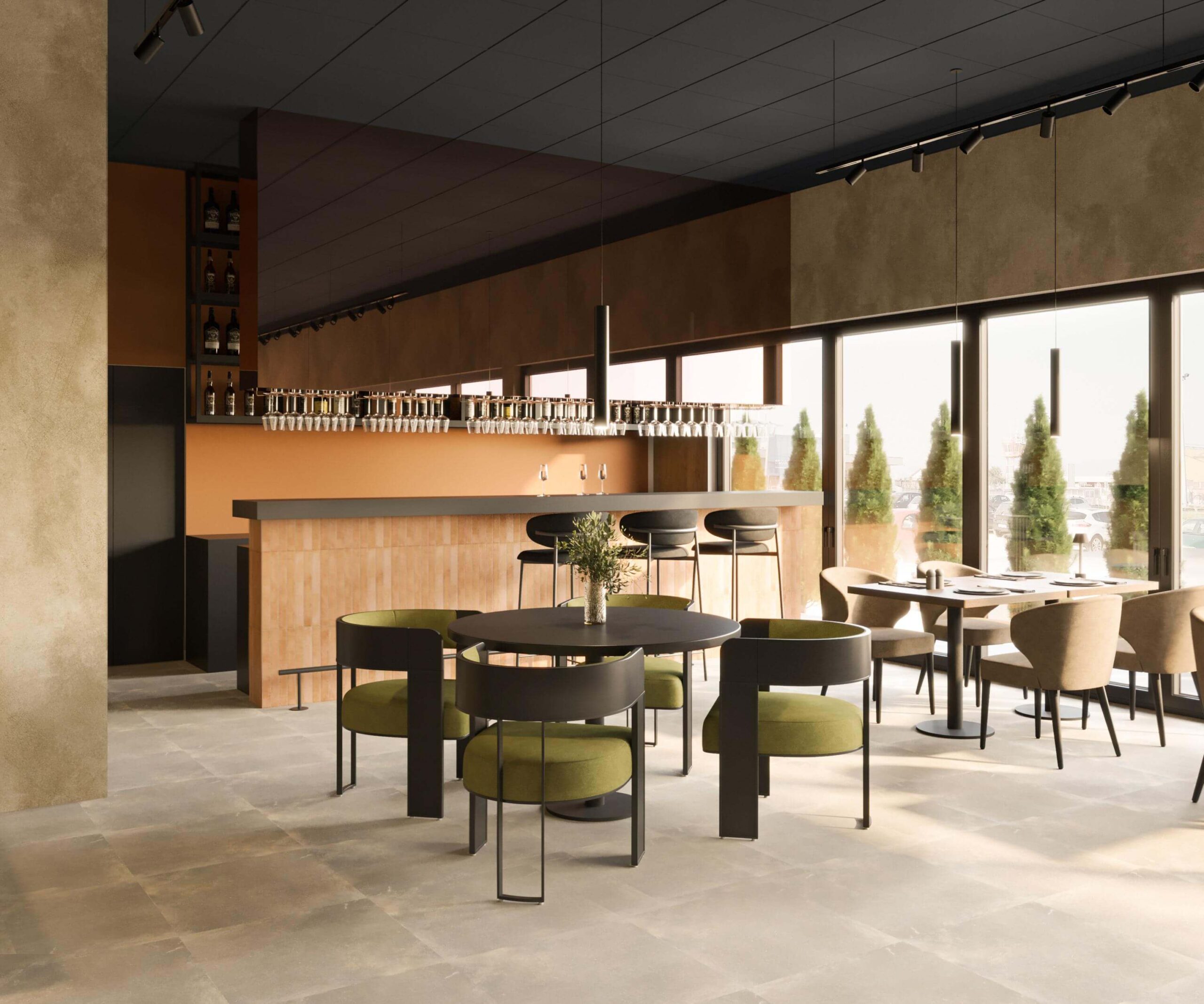
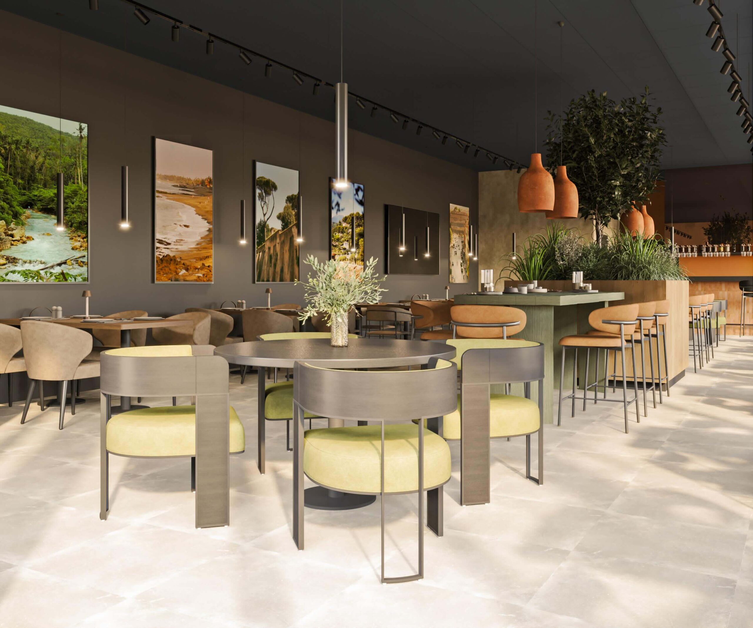
PROJECT COSMØ HOUSE
A journey without departure.
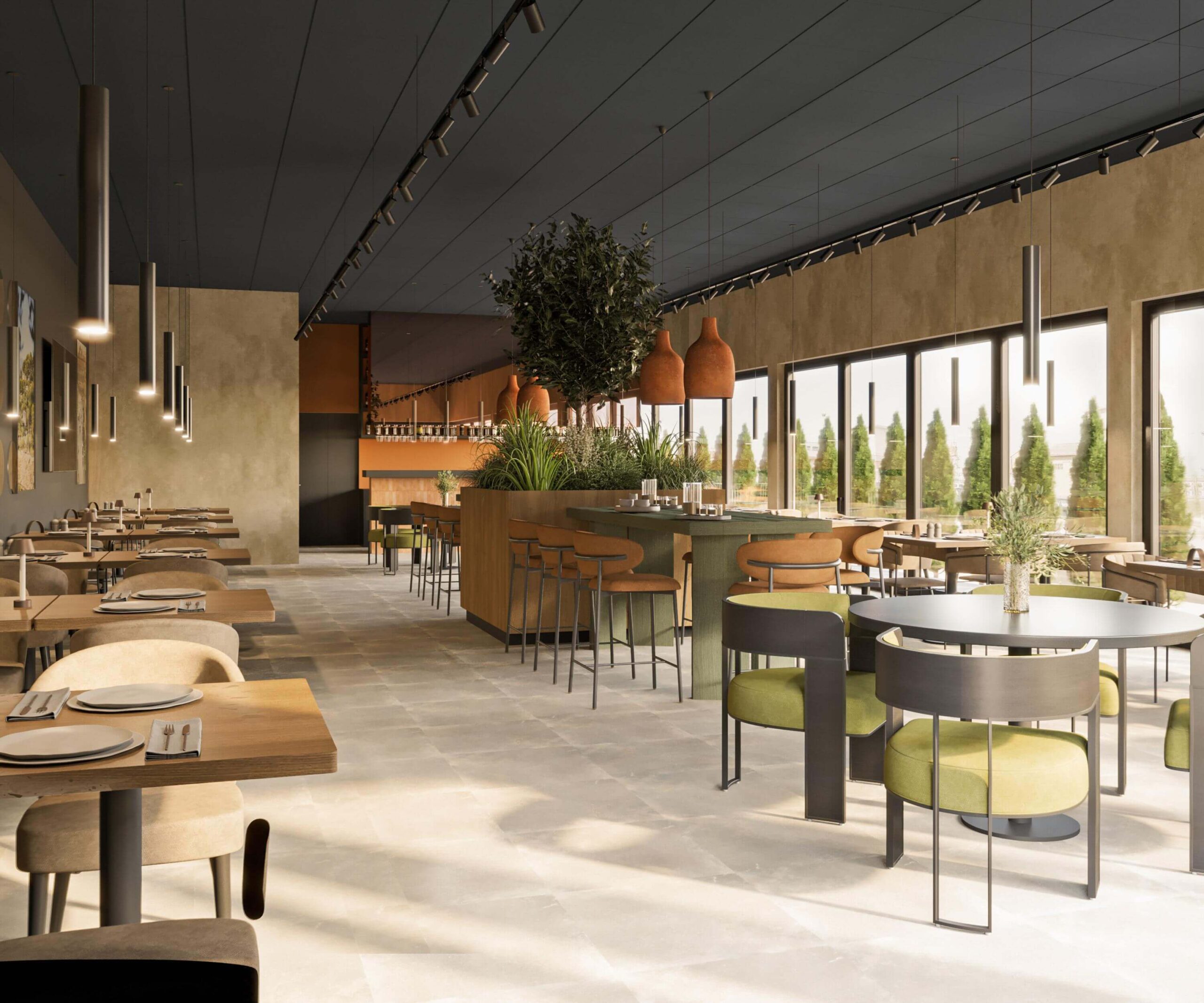
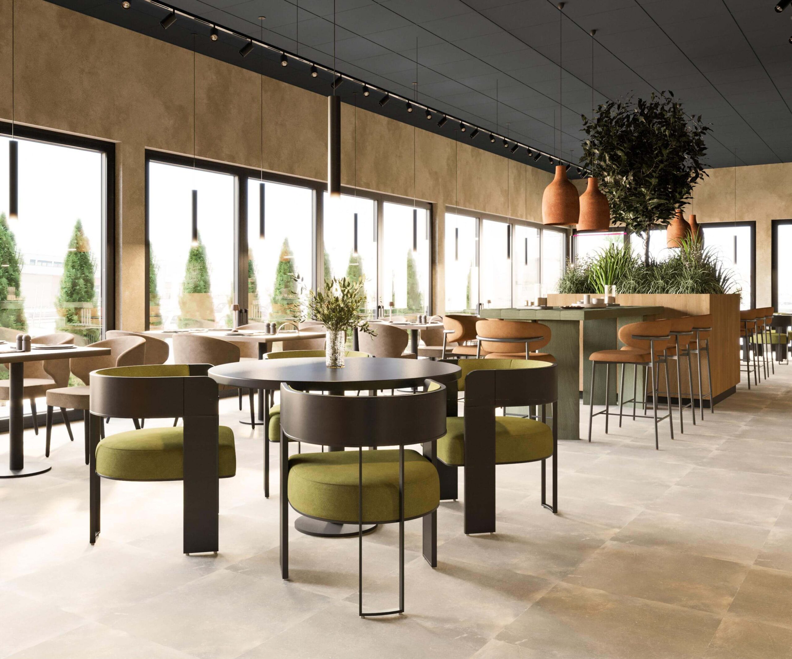
You enter through industry. You leave with the feeling you’ve just been somewhere. In between – Cosmø House.
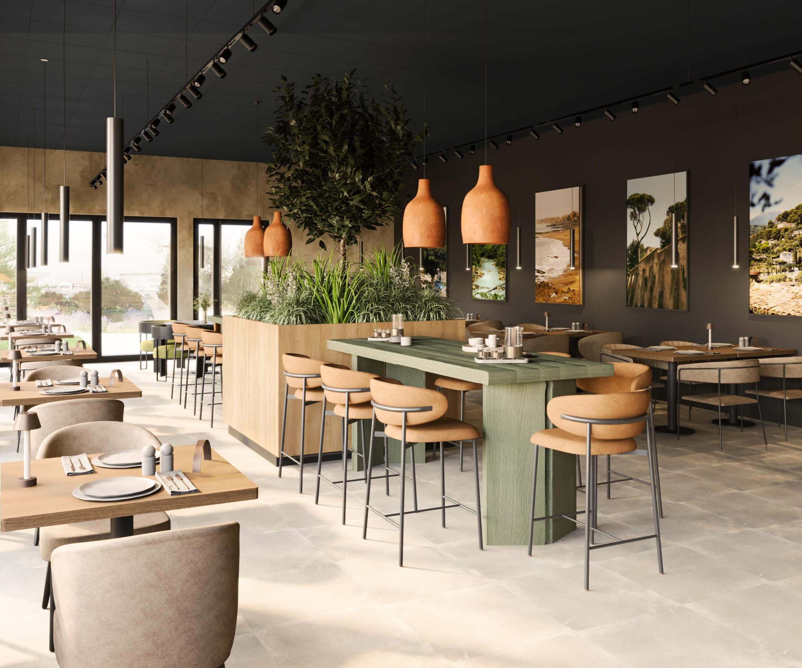
There was no attempt to escape the industrial setting. The idea was to walk through it, with soft green accents, warm terracotta tones, and a charcoal ceiling that sets a gallery-like atmosphere. On the walls, actual journeys. I realized this space was ideal for my photographs, taken across different places and times. They became the visual anchor of the interior. Everything else was built around them seating, lighting, sightlines.
The garden isn’t outside. It’s everywhere. A tree in the middle, shrubs spilling in, plants that aren’t just for show, they calm. They reset. People don’t come here just to take a break from work. They come to take a break from everything.
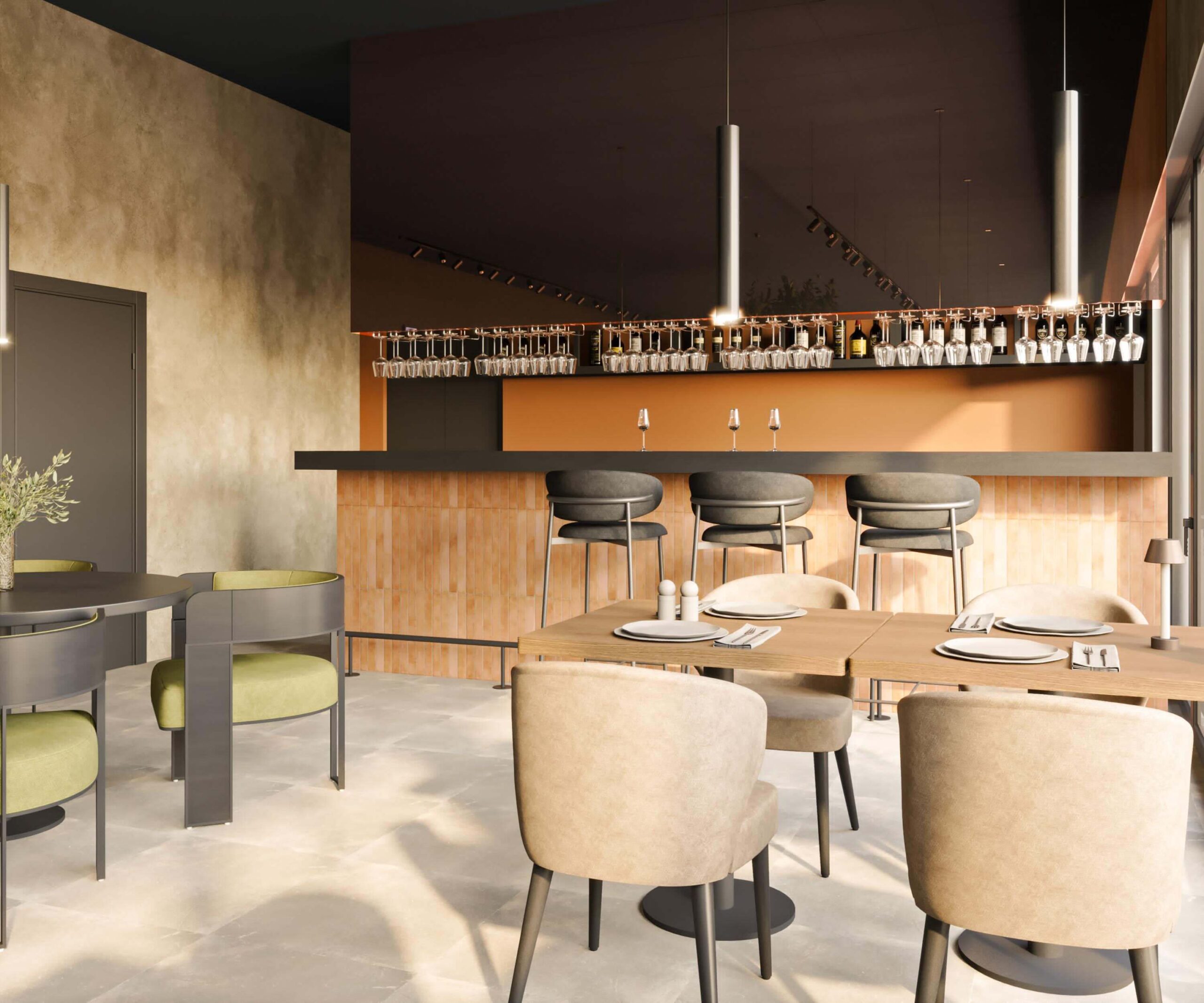
And what’s a space without a bar? Simple in design, but lined with mirrored glass that visually expands the room, as if doubling it. It’s not a trick. More like a quiet reminder that everything depends on how you look at it.
Cosmø House doesn’t try to stand out. It doesn’t shout. But it gets under your skin. And lingers just a little after you’ve left. That was the whole point.
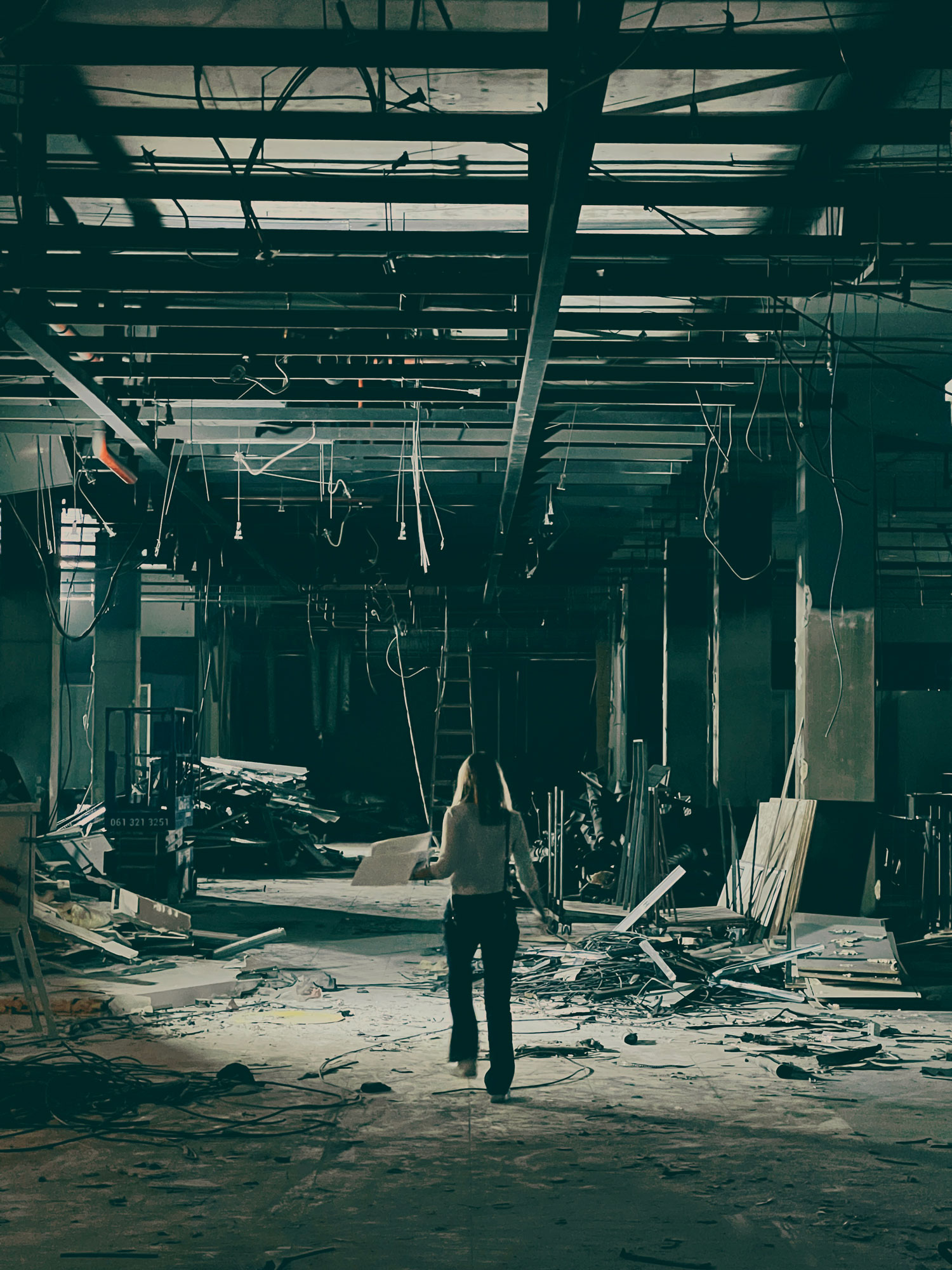
LUXURY DOESN’T MEAN ANYTHING ANYMORE
What’s worse—that luxury has become a meaningless cliché, or that people no longer recognize it at all?
Today, everything is “luxury”—Italian tiles and Chinese glass. Gold frames and concrete walls. Apartments in prime locations and those in the middle of a cornfield, as long as an agent convinces you it’s “the next big thing.”
Anything can be sold if it’s wrapped in enough empty words.
Luxury. Premium. Exclusive.
On paper, those words sound powerful. In reality, they’re cheap tricks for easy buyers.
And it’s not just here. The world is flooded with overpriced, repackaged things that once had meaning, but today exist just to be bought and displayed.
But who still cares about substance?
Who asks if something has real value—or just a high price tag?
Who dares to say the emperor has no clothes?
No one. Because everyone plays the same game. Safe.
Real estate? On the verge of collapse. Square meters priced beyond their worth.
Design and architecture? Overhyped, reduced to waitlists and meaningless catalogs.
Services? Sold as art, yet in reality, the same beige renders, the same false idea of beauty, the same imitation of something we will never be.
We all know this, yet no one wants to pop the bubble.
And then people wonder why we’re surrounded by soulless spaces.
Why everything looks the same?
Why it feels like we’re living in a furniture showroom graveyard, not in a space that reflects us?
Maybe because it’s time to start calling things by their real names.
Maybe because design isn’t what you see—it’s what you feel.
Because a space isn’t what you buy—it’s what remains after you leave.
Because it’s not about being “Instagram-worthy,” but about not being annoyed by the wrong light in the morning, or instinctively knowing where to set down your glass at night.
Those are the little things.
But those are also the big things.
That’s the difference between an “expensive property” and a truly valuable space.
At Stefan Miloš Studio, we don’t do wedding cakes or cheap pastries.
No pink filters. No empty words.
Design isn’t a luxury. Design is a necessity.
But only if you know what you’re doing.
And I will always be loud about this.


FROM DESERT TO STUDIO
Where were you three years ago?
— In Nice. The evening market, the one that sells lavender in the morning and turns into an open-air restaurant at night. On the table—oysters, rosé wine, good company.
Then, spontaneously, I asked my friends a question. One of those that has no right answer.
“If money wasn’t a factor, what would you do and where would you live?”
Ceca: “Amsterdam, maybe switch to freelance.”
Irena: (long pause, nervous laugh) “I don’t know… I’d have to think about it. Maybe I’d go with Ceca.”
Danilo: “Belgrade, of course.” And as if waiting for the moment, he adds his signature line: “I do not dream of labor.”
And me? I said, “Atelier.”
Not an office, not a workspace, not a “studio.” Something that didn’t have a form yet, but was already there.
And? Did you build it?
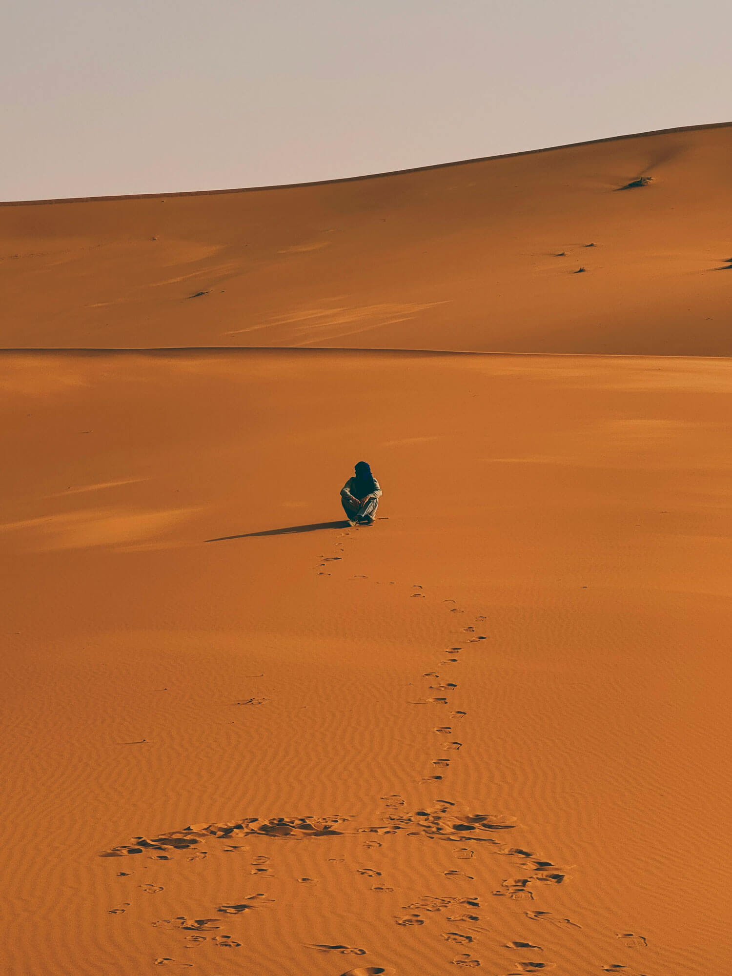
— Not right away. Two deserts later, the idea took shape. The first was Wadi Rum in Jordan.
Ah, the classic route – Mediterranean, then Mars?
— I don’t know what’s considered classic. But I do know that Wadi Rum is one of those places that either break you or put you together.
And what did it do to you?
— The silence drowned out the noise in my head. In the desert, you realize how much you actually don’t know. How much you thought you knew. How much you thought you wanted.
That’s why Not A Studio isn’t a studio name. It’s the name of an idea. The studio itself carries my full name (however strange it may sound to some people).
What idea?
— That architecture isn’t a final product but a method. That you don’t just draw buildings or interiors, you design the way people experience space. That the best projects are the ones that don’t even know they’re projects yet.
What does the studio look like?
— Like a desert at sunset. Like the Mediterranean at noon. Warm, golden, sandy, but with a dose of cold stone.
I knew the colors before I even knew what I was creating. I’ve been in this space before, maybe in another life. Zvezdana confirmed it.
Sounds chaotic. Abstract.
— Of course. But chaos has rules, just not the usual ones.
Are you saying this isn’t for everyone?
— I’m saying this is a party with a face-checker at the Door.
And what’s the dress code?
— There isn’t one. But if you think you already have all the answers—you might be in the wrong place.
Last question. This is definitely not a typical introduction, is it?
— This is not a typical anything.
Welcome.

UŠĆE SHOPPING MALL - MARKET SQUARE
Stefan Miloš
Area: 4000m2 | Year: 2024 | Location: Belgrade | Client: Main and responsible construction contractor MOA inženjering d.o.o. | Photography: Stefan Miloš
From Dead Space to Must-Visit
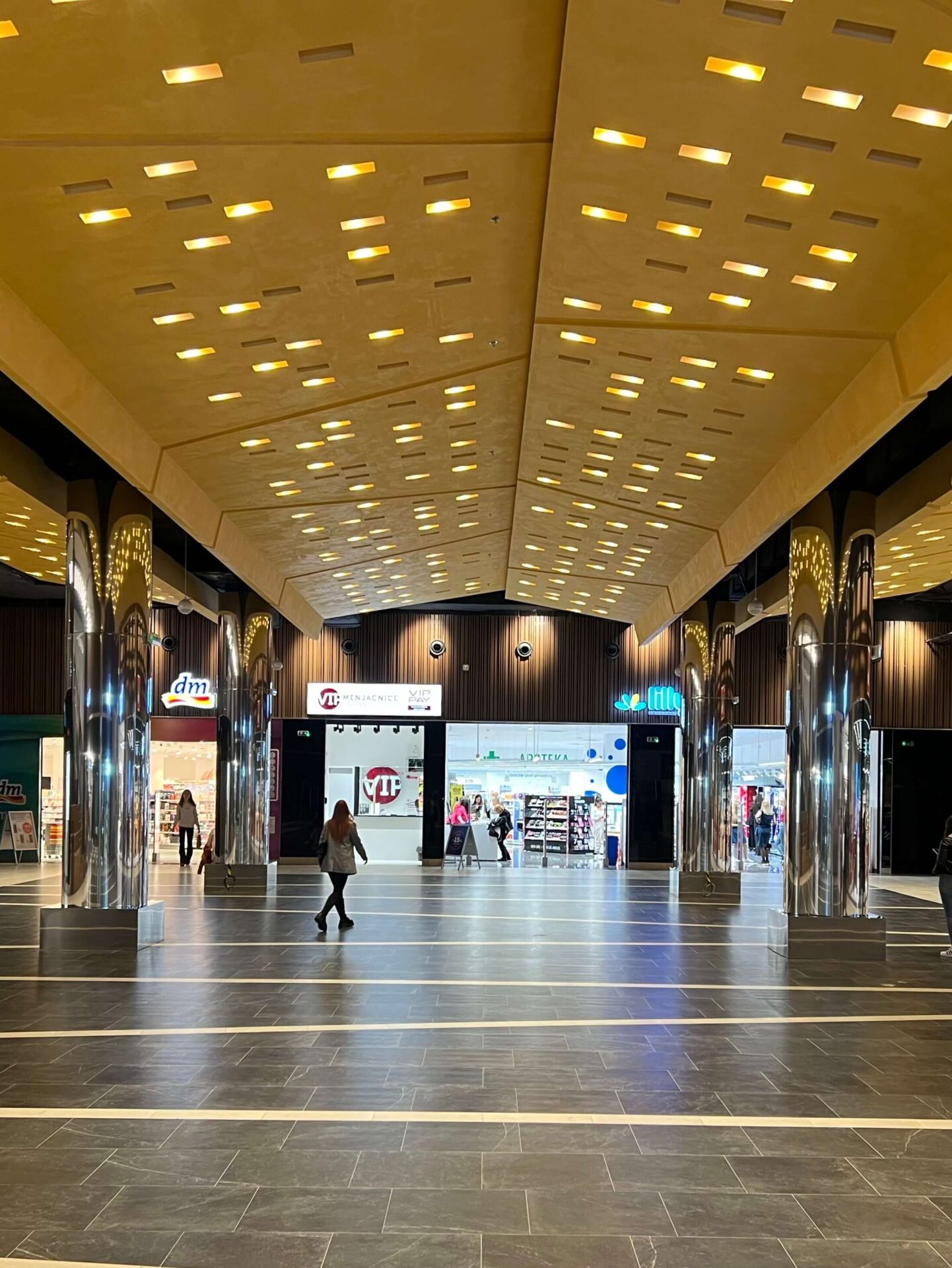
You know that one spot in a mall—the one you go to because you have to, not because you want to? That was level -2 in Ušće. A low-ceilinged, crammed, totally uninspired space where major grocery and drugstore chains were basically the only reason anyone ended up there. It felt like the mall’s forgotten corner—until it didn’t.
The challenge? Make it a place people actually enjoy. Make it breathe. Market Square was the answer.
Project Info
Inspired by the organic flow of traditional markets, the space was reimagined with a modern twist. A bold yellow ceiling adds warmth and energy, contrasted by anthracite details and brass-covered columns that reflect light like giant mirrors, expanding the space visually. The entire layout was designed to be more than just a shopping shortcut—it’s an experience. Seating cascades down in an amphitheater-like style, encouraging spontaneous gatherings, a pause from the shopping rush, or simply a spot to take it all in. And with planned shopping events, exhibitions, and activations, Market Square is set to become the mall’s new social hub.
Oh, and we did all of this while the entire mall was still running. First project of its kind in Serbia. No pressure, right? But now, Market Square is exactly what it was meant to be—a place you don’t just pass through, but one you actually want to stay in.